Power BI Templates & Dashboard Examples
Windsor.ai guarantees an easy and seamless way for Power BI marketing reporting. By leveraging free Power BI templates, you can optimize your marketing spending and investments. Access free Power BI dashboard templates with easy-to-follow instructions for connecting your own data. Find the correct template from Microsoft Power BI gallery and start using them to save time, effort, and increase productivity.


4 rules to create the optimal Power BI dashboard examples for marketing reporting
The importance of data-driven marketing cannot be underestimated. With the help of data, companies can understand what their clients want to target, interact, and connect with them effectively. Power BI plays a vital role in uncovering important insights from data, and that’s why you should make it your marketing reporting partner.
Power BI features a range of dashboards that you can use to represent your data in various ways. Examples of visualization options include tables, cards, geographical plots, maps, different chart types, and more. In fact, the possibilities for Power BI dashboard examples are only limited by the developer’s creativity.
By structuring and displaying data in a Power BI dashboard, marketers can quickly identify which marketing strategies are working well and which are underperforming. Let’s discuss below the 4 rules that you need to apply when creating Power BI dashboards for effective marketing reporting:
1. Center your dashboard for marketing reports on one subject
Start by asking yourself: What are my marketing goals? What do I want to accomplish? And what are the major indicators that highlight my progress towards that particular goal? After setting the goals to enhance your marketing objectives, develop separate dashboards tailored to each key criterion.
2. Use the proper diagram to view your information
The next step is to select the best chart to represent your data. But, with so many options to choose from, how do you identify the right one? First, know the message you want to display. It could be comparing values, showing targets, displaying an evolution, etc. Next, you can identify the chart type that clearly represents that concept without confusing the viewer. It’s that simple!
3. Compare and visualize developments
Now you have your charts in place and your audience can clearly see the KPIs, it’s time to add context to your dashboard.
Imagine running a brilliant marketing campaign that has produced many new ideas. The last thing you want is for your manager to say: “That’s terrific, but in the end, nobody bought our stuff.” You can have a substantial impact if you illustrate how your marketing activities relate to the business context. Marketing data is always a risk when you look at them in isolation. You will avoid working in silos by integrating marketing and selling data together. Line charts are the best technique to represent a change in time.
4. Make your dashboards operative
With the recommendations above, you may construct solid marketing dashboards displaying vital marketing data in one glance. But what’s the use of such insights if no one wants to act on them afterwards? To handle this, clearly highlight the actions the team can take when certain benchmarks are reached.
Here is a simple four-step method if you want to develop comparable Power BI dashboards for your organization:
- Collect all your marketing information on Power BI with Windsor.
- Connect Power BI to a data display platform.
- Construct a dashboard with up-to-date data at all times
- Regularly use your dashboards and alter them as your objectives change over time.
10 Best Power BI Dashboard Examples in 2024
Discover Power BI dashboard examples and how they work.
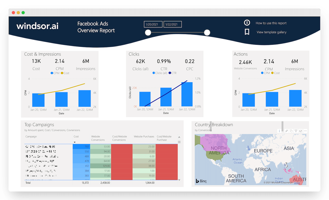
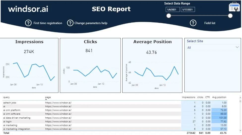
Website Analytics Dashboard
This is one of the many Power BI dashboard templates used for visualizing data. In this case, it lets you know how customers interact with your website. It gathers website analytics data and presents it in an easy-to-read format so you can get important insights and determine website performance against benchmark metrics.
Try Website Analytics Dashboard
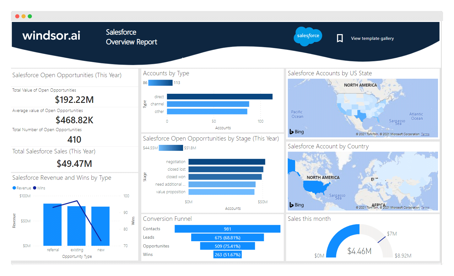
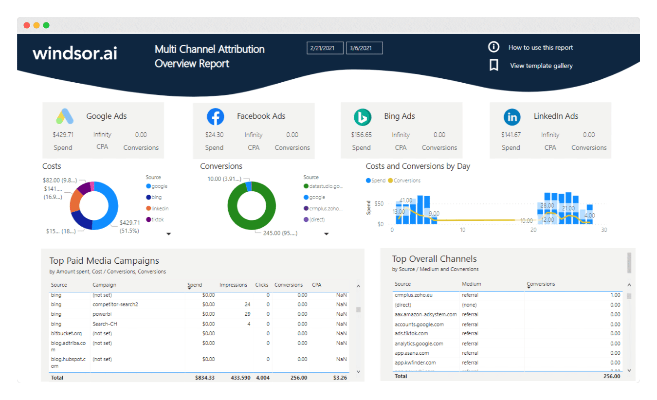
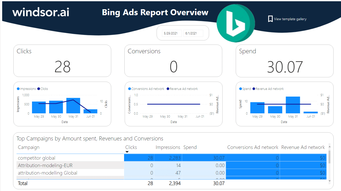
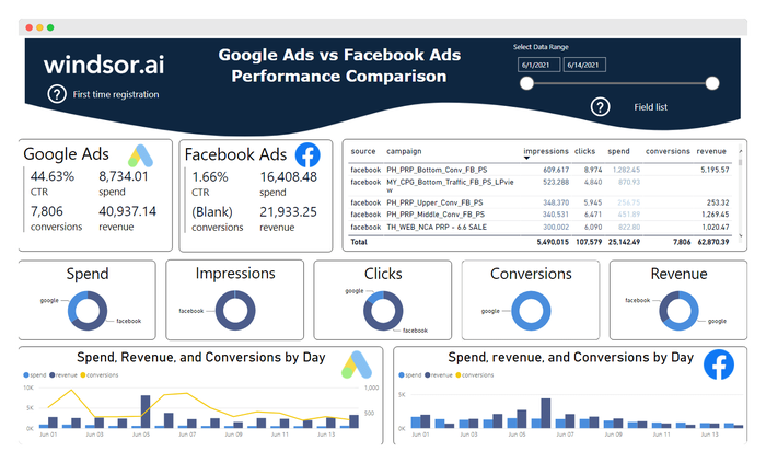
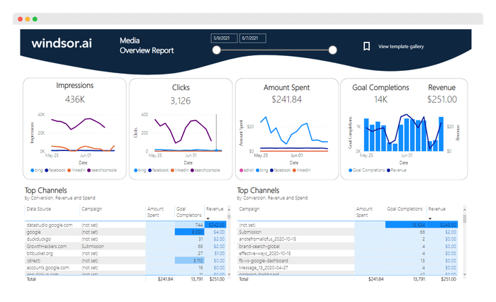
Marketing Dashboard
Using this dashboard from Power BI, you can generate marketing reports that highlight the findings of your marketing research. It helps you identify customer trends and develop strategies to meet their needs.
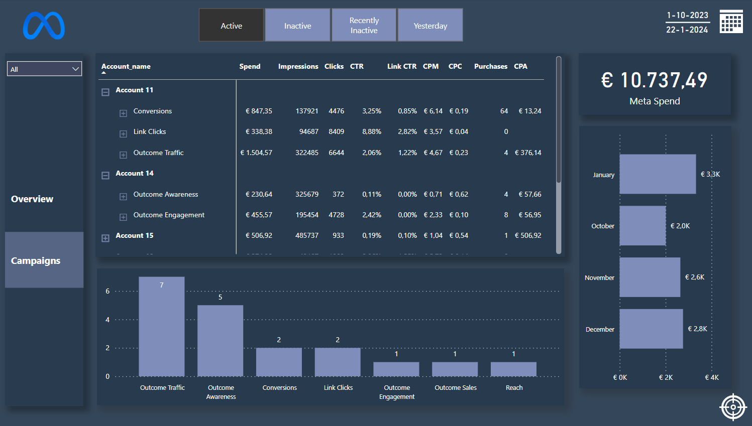
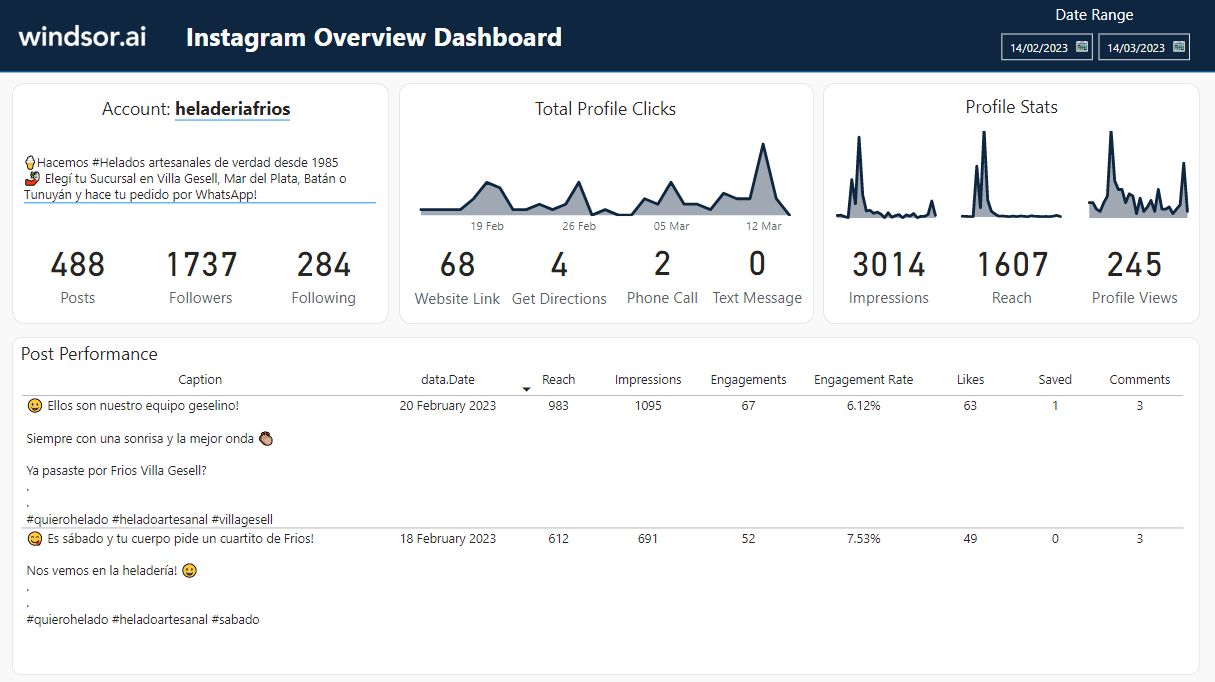
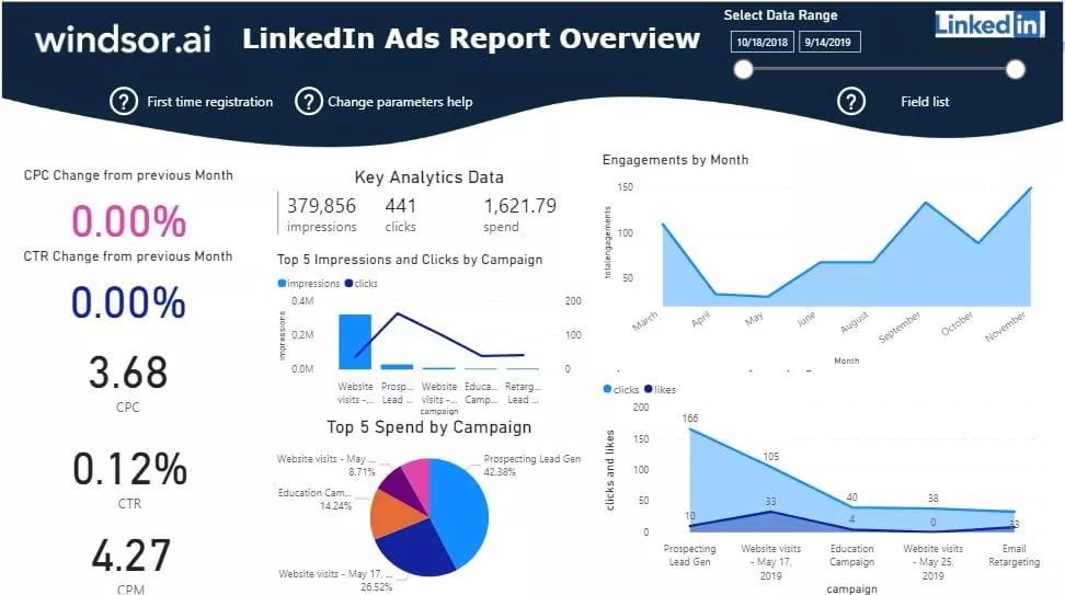
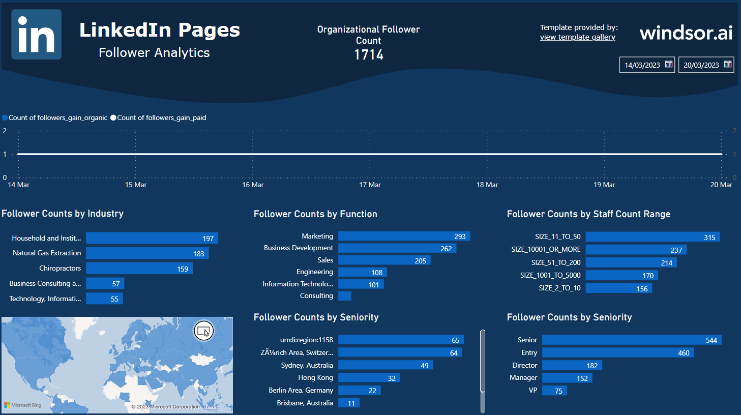
Social Media Dashboard
Here, you have a realtime dashboard that offers an overview of your team’s efficiency in influencing impressions on various social media platforms. You can also identify the best-performing social networks and know where to focus your marketing activities.
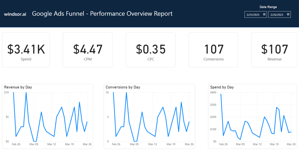
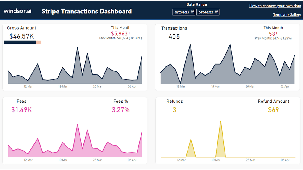
Sales Dashboard
The Power BI sales dashboard enables you to understand business performance by visualizing important metrics. This way, you can identify areas needing more attention to meet sales targets.
Try Sales Dashboard
Finance Dashboard
The finance dashboard highlights important information like profitability, revenue, expenses, budgets, etc., enabling high-level insights into financial performance. This allows executive-level staff in your organization to make informed decisions on matters related to investments, budgeting, and resource allocation.
HR Dashboard
You can capitalize on the HR express dashboard available in Power BI to visualize employees’ demographics, monitor new hires, and ensure you meet diversity standards. It’s also possible to gain high-level insights related to average salary, age, and employment duration to understand who your employees are.
Logistics Dashboard
With the assistance of the logistics dashboards and Power BI report builder, logistics managers within your organization get important information on the flow of goods. As a result, they can pinpoint areas of low/high product flow and allocate resources more effectively.
Customer Analysis Dashboard
Power BI customer analysis dashboard enables you to visualize your customers’ demographics and understand how they affect your relationship. Consequently, you can identify valuable and less valuable clients. This eventually helps you focus efforts on clients offering higher ROI.
Customer Satisfaction Dashboard
With this dashboard, you can learn how customers rate your products or services. The insights you get guide you in improving your operations to meet customer expectations and optimize customer satisfaction.
Executive Dashboard
Power BI provides the executive dashboard, mainly designed for executive-level employees who want to understand business performance. Through this platform, you can monitor key metrics and determine if interventions are necessary to enhance or maintain a particular performance metric.
All the mentioned dashboards are accessible in the Data galleries at the Power BI community portal.
FAQs
What is Power BI?
Power BI is a cloud-based tool designed by Microsoft to help users analyze and visualize data. As a result, they can gain important insights, which guide them to make informed decisions. The platform supports the integration of multiple sources, making it a flexible choice for businesses with different data needs.
What is Power BI used for
Power BI is used for data analytics, business intelligence, and visualization. With its array of features, Power BI enables users to explore data, share insights, and collaborate with others to influence business growth and efficiency.
How to share Power BI report
There’s more than one way to share Power BI reports. Users can publish them on the Power BI service, export as PowerPoint or PDF, send an email invitation to recipients, or publish to the web for public sharing using a URL.
How much is Power BI
Power BI offers a free version for users who would want to test the service before subscribing to any payable plan. There are options to upgrade to Power BI Pro for $10 monthly or Power BI premium, which goes for $20 per month.
Power BI free vs. Pro
The free plan lets users generate rich, interactive reports and dashboards through Power BI report templates. It’s ideal for individual users or small teams with few needs. The Pro plan provides additional features like advanced data refresh and scheduling options, as well as collaboration and sharing capabilities.

Try Windsor.ai today
Access all your data from your favorite sources in one place.
Get started for free with a 30 - day trial.