
Budget Optimizer – Understand your data
 4 July 2025
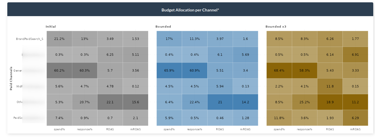
In the following article we will discuss how to read the data using the Windsor.ai budget optimizer, how to think like a businessperson and how to improve your company using a simple dashboard. Without further ado, let’s start and try to understand the data.

The first thing you will see are the parameters shown in the boxes above. The Adjusted R2 shows how well our software fits your data. The general rule of thumb is that R squared < 0.8 is not ideal, 0.8 < R squared < 0.9 is acceptable, R squared > 0.9 is ideal. Further, the NRMSE (Normalized root-mean-sum-square) distance is the prediction error. Pretty much it shows the difference between the actual value and the predicted one. It takes all the differences between actual and expected results and normalizes them. Lastly, the DECOMP.RSSD represents the difference between share of spend and share of effect for paid media channels. It is differently known as the business error.
Response Decomposition Waterfall by Channel
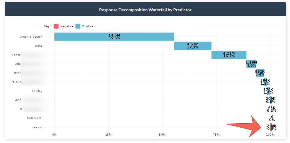
In the graph above we can see the contribution of each marketing channel and other factors. For example, it can be observed that Organic Search constitutes about 55% of all sales. Moreover, we can see the effect of holidays, seasonality and trend to get a better glance into the reality of the sales. A crucial note here would be to take into account the negative effects which some channels could bring into the table. In the example dataset we can see that seasonality decreases sales by nearly one percent. For example, if you sell umbrellas you are more likely to sell them during fall and winter than during other seasons.
Actual vs Predicted Response

The graph above shows how well the selected model predicts your data. The orange line shows the actual response versus the blue dotted line which depicts the predictions.
Total Spend vs Effect with total ROI

Share of spend reflects the relative spending of each channel, whereas, the effect shows the overall contribution in sales driven by each channel. ROI represents the efficiency of each channel which takes the incremental value of each channel divided by the spent of that channel.
Key notes:
– If ROI is large but spend and effect are small, then consider increasing the spending on it since it is performing well.
– If ROI is small but spend and effect are large, normally less money should be spent due to underperformance. However, this needs to be thought carefully because it may be a channel that brings a lot of sales.
In the example above, we can see that Performance Max has a lower Return on Investment than Performance E Max Bing even though the latter has less of an effect share.
Geometric Adstock: Fixed Rate Over Time

This chart represents the decay rate each channel has by week. The higher the decay rate, the longer the effect a specific media channel has after the initial exposure. We can see that the Referral channel’s effect is 38.1% on average.
Immediate vs Carryover Response Percentage

The graph above shows the effect of each channel on the given period. For example, we can see that 48% of the sales are driven within the current week for Brand Paid Search, whereas, 52% of the sales are carried to the upcoming week.
Saturation Curves

The graph above shows if a media spend is at an optimal level or not. The faster the media reaches an inflection point and a horizontal slope, the quicker it will saturate with extra dollars spent. Generally, we should invest in more saturated outcomes to improve outcomes. The image below shows the saturation information needed in order to make a decision.

In the graph above the points at which the optimal spend should be allocated are displayed.
Model Performance
The following graphs show the model performance for people who are more into technical details.

The fitted vs residual graph shows whether the quality of the model is acceptable. It displays the fitted vs residual values. It usually helps to see if we have outliers in data, variance errors, and more.

The model uses bootstrapping to calculate uncertainty of ROAS or CPA. After obtaining all pareto-optimal model candidates, the K-means clustering is applied to find clusters of models with similar hyperparameters. In the context of MOO, we consider these clusters sub-population in different local optima. Then we bootstrap the efficiency metrics (ROAS or CPA) to obtain the distribution and the 95% interval.
Scenarios
Next, let’s move to the tab where you can play with parameters and make decisions. Firstly, let’s take a look at the parameters.

There are three important aspects to consider when changing inputs. The first parameter is total spend which is the total amount of money allocated in the date range selected. By default this is selected over the entire dataset length. The second parameter is the channel percentage which represents who much you want to allow your channel to increase/decrease when training the model. For instance, 80-120 allows your channel to decrease by a minimum of 80% and increase to a maximum of 120%. So, the model will try to optimize the constraints for all the channels to provide the best possible allocation. The third parameter is the date range. If you want to make predictions on more recent dates, you can change the date range to reflect that.
Total Budget Optimization

Let’s suppose that we chose an 80-120 range for all channels in the inputs. The graph above depicts the actual values (gray), the best combinations of all channels for 80-120 increase/decrease (blue), and the 3x bounded (yellow). The idea of showing 3x bounded results is to make it easier for the analyst to observe the difference between the constraints they chose and larger constraints (3x in this case). Moreover, the graph shows the total spend, response and ROAS increase. In the example above, we can see that without increasing the budget at all we can improve the revenue by 4.72% (bounded) or 12.10% (3x bounded).
Budget Allocation per Channel
Above we saw that we can actually improve our revenue without even spending more but we were not told how. The budget allocator graph shows exactly how to do that. Given the inputs you selected (bounded values – blue), you can see how each channel increases or decreases. To get a 4.72% increase in revenue, we would need to, among other things, decrease the spending on Brand Paid Search to 17% of the total budget. If we do so, we will get an 11.3% (lower than what we had before – gray), revenue in total budget but it will give other channels the chance to increase more. This optimizes our channels such that even though we spend less previously, the Return on Ad Spend and Marginal Return on Ad Spend both increase. Again, as in the previous graph, the yellow bounded x3 shows the values if you were to increase the inputs on the sidebar by 3 times.
Simulated Results

The next graph shows how the simulation works. Let’s stick again with the Brand Paid Search graph (first). The image describes the gray area which is the part of the immediate effect. After that point, the effect starts to carry over to the next period. Then, the initial point or the point at how much you are currently spending. Lastly, we have the blue and orange points representing bounded and 3x bounded, respectively. As previously, the model suggests to decrease the total percentage spent on Brand Paid Search. It can be seen that for both bounded and 3x bounded the model selects the lowest restriction, meaning decreasing the spending to 80% or 40% of the current value.
Lastly, while working with parameters you may want to see a detail quickly. We have added the ? button which will show you some quick info for each graph on the dashboard.


