 AI insights
 About us
 Careers
 Security
 Customer reviews
 Contact us
 Affiliate program
 Solution partners
 Looker Studio templates
 Tableau templates
 Facebook Ads templates
 Google Ads templates
 Data fields & Metrics
 AI prompt library & Guides
 Product documentation
 API documentation
 Case studies
 Blog
Blog Data models
 Windsor vs Supermetrics
 Windsor vs Fivetran
 Windsor vs Portermetrics
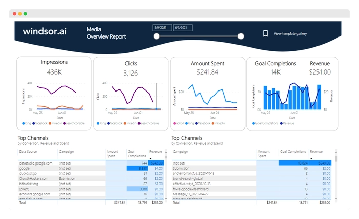
Free Power BI Templates & Dashboard Examples
Get started faster with free, ready-to-use Power BI dashboard templates from Windsor.ai.
Connect your marketing data in a few clicks, sync from 350+ sources, and analyze cross-channel performance in a pre-built Power BI dashboard—no code or manual setup required.
Free Facebook Ads Power BI Dashboard Template
Free Google Ads Power BI Dashboard Template

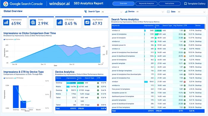
Free Google Search Console Power BI Template
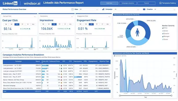
Free LinkedIn Ads Dashboard Template on Power BI

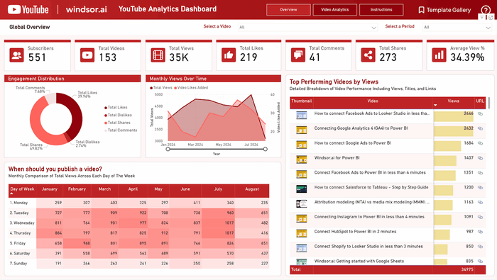
Free Power BI YouTube Analytics Dashboard Templates

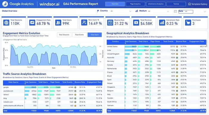
Google Analytics 4 (GA4) Dashboard Template on Power BI


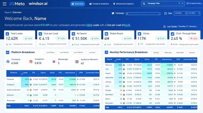
Meta Ads Template for Power BI
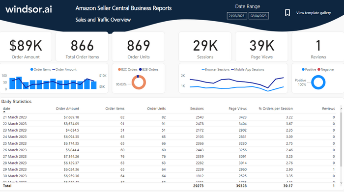
Power BI Amazon Report Dashboard Template
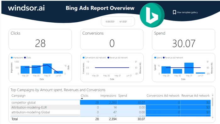
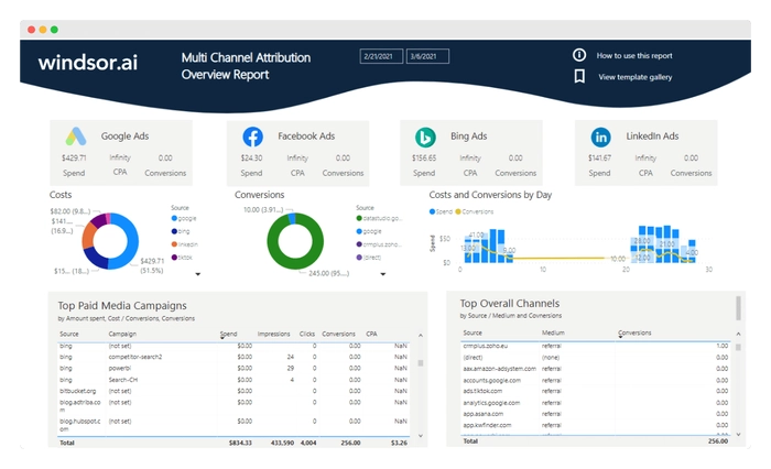
Power BI Bing Ads Report Dashboard Template
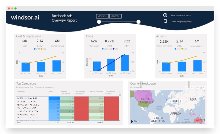
Power BI Facebook Ads Report Dashboard Template
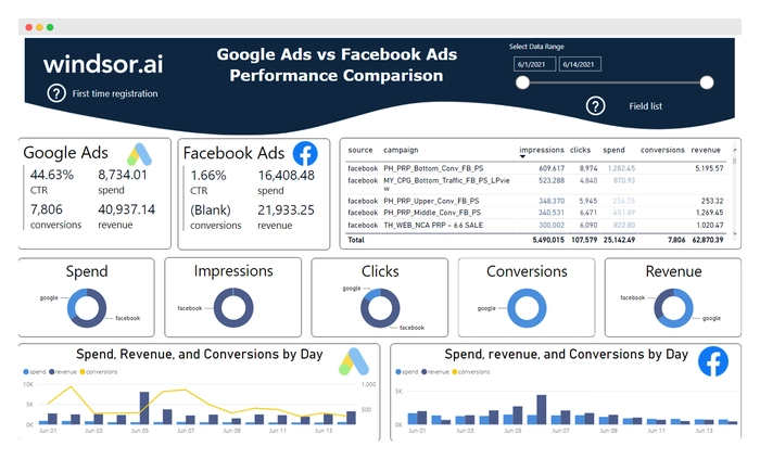
Power BI Facebook Ads vs Google Ads Report Template
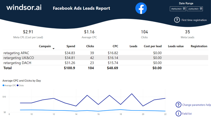
Power BI Facebook Leads Report Dashboard Template
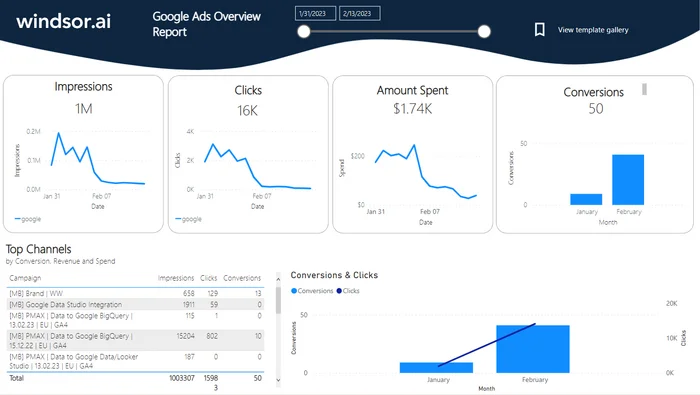
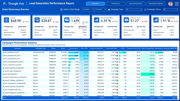
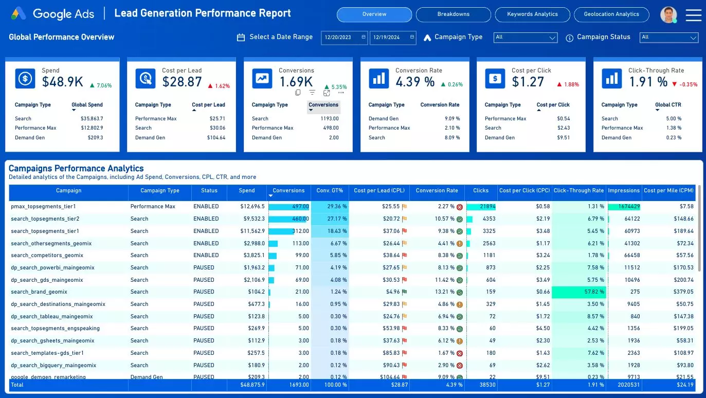
Power BI Google Ads Dashboard Template
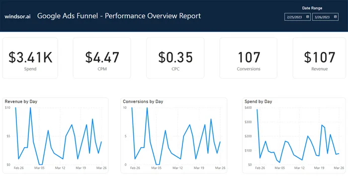
Power BI Google Ads Funnel Overview Dashboard Template
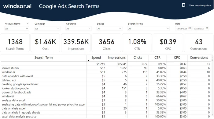
Power BI Google Ads Search Term Dashboard Template
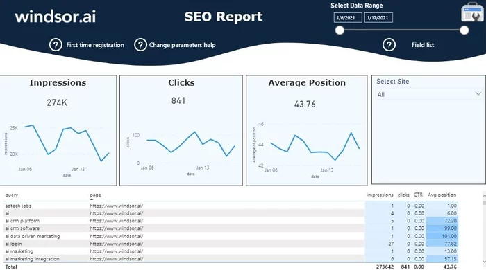
Power BI Google Search Console Report Dashboard Template
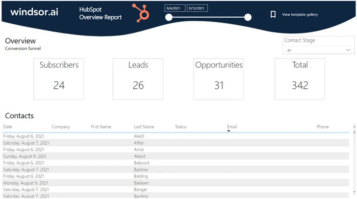
Power BI HubSpot Overview Dashboard Template

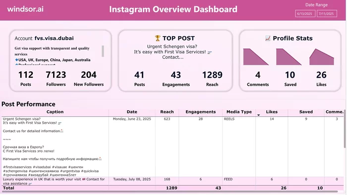
Power BI Instagram Dashboard Template

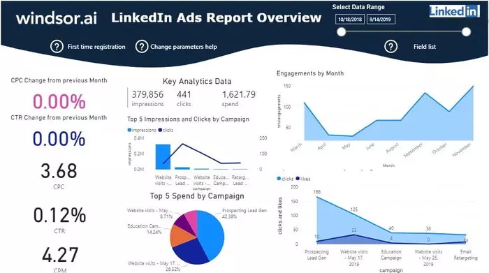
Power BI LinkedIn Ads Report Dashboard Template
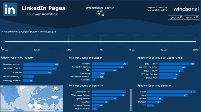
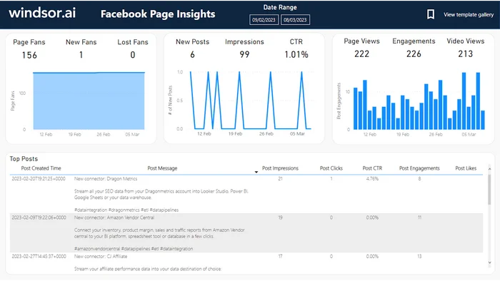
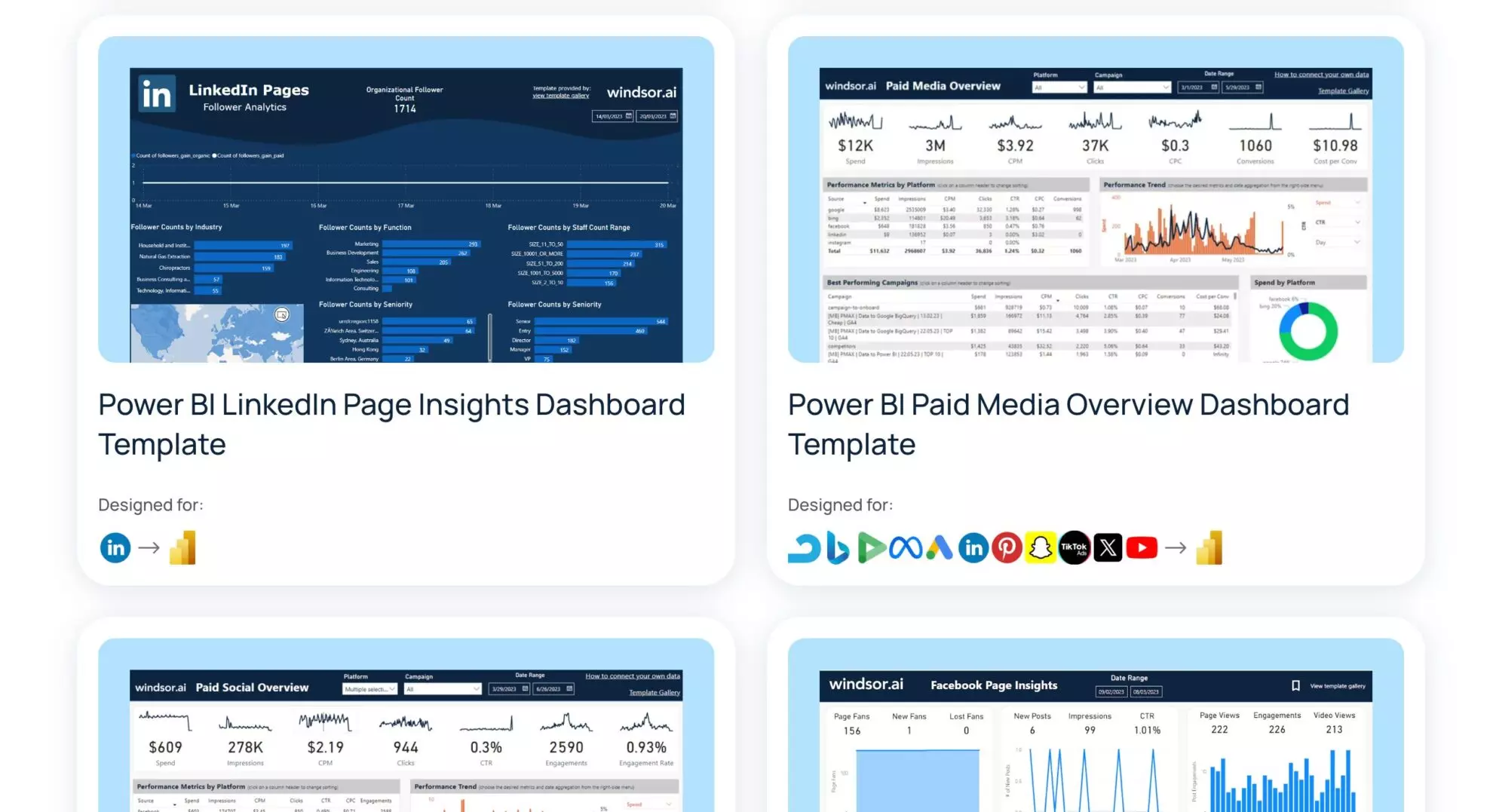
Power BI LinkedIn Page Insights Dashboard Template
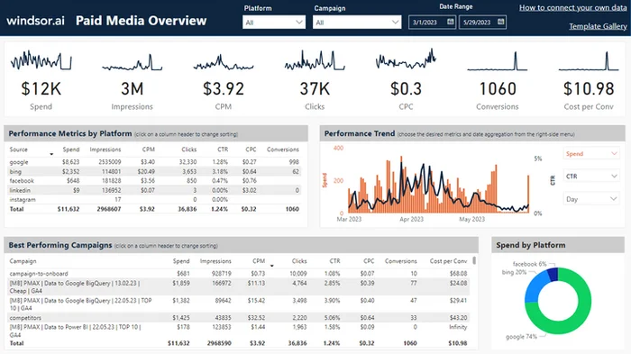
Power BI Paid Media Overview Dashboard Template


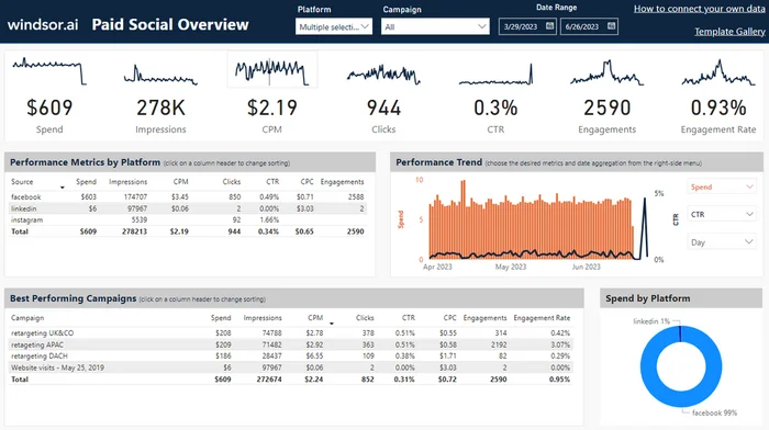
Power BI Paid Social Media Overview Dashboard Template
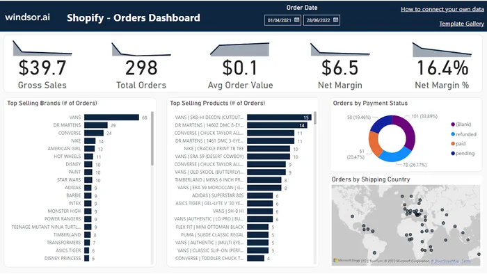
Power BI Shopify Overview Dashboard Template

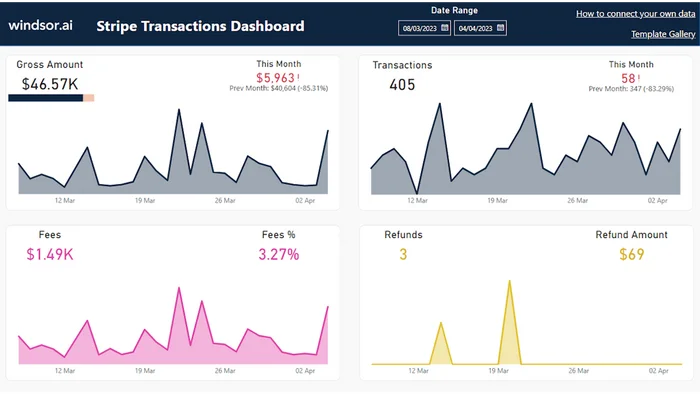
Power BI Stripe Transactions Dashboard Template

How to set up Windsor.ai's Power BI templates
Prerequisites
- Power BI Desktop or Web installed
- Active Windsor.ai account with an API key
- Template downloaded
Select the template from the Windsor.ai gallery
On this page, select the template that best suits your data needs.
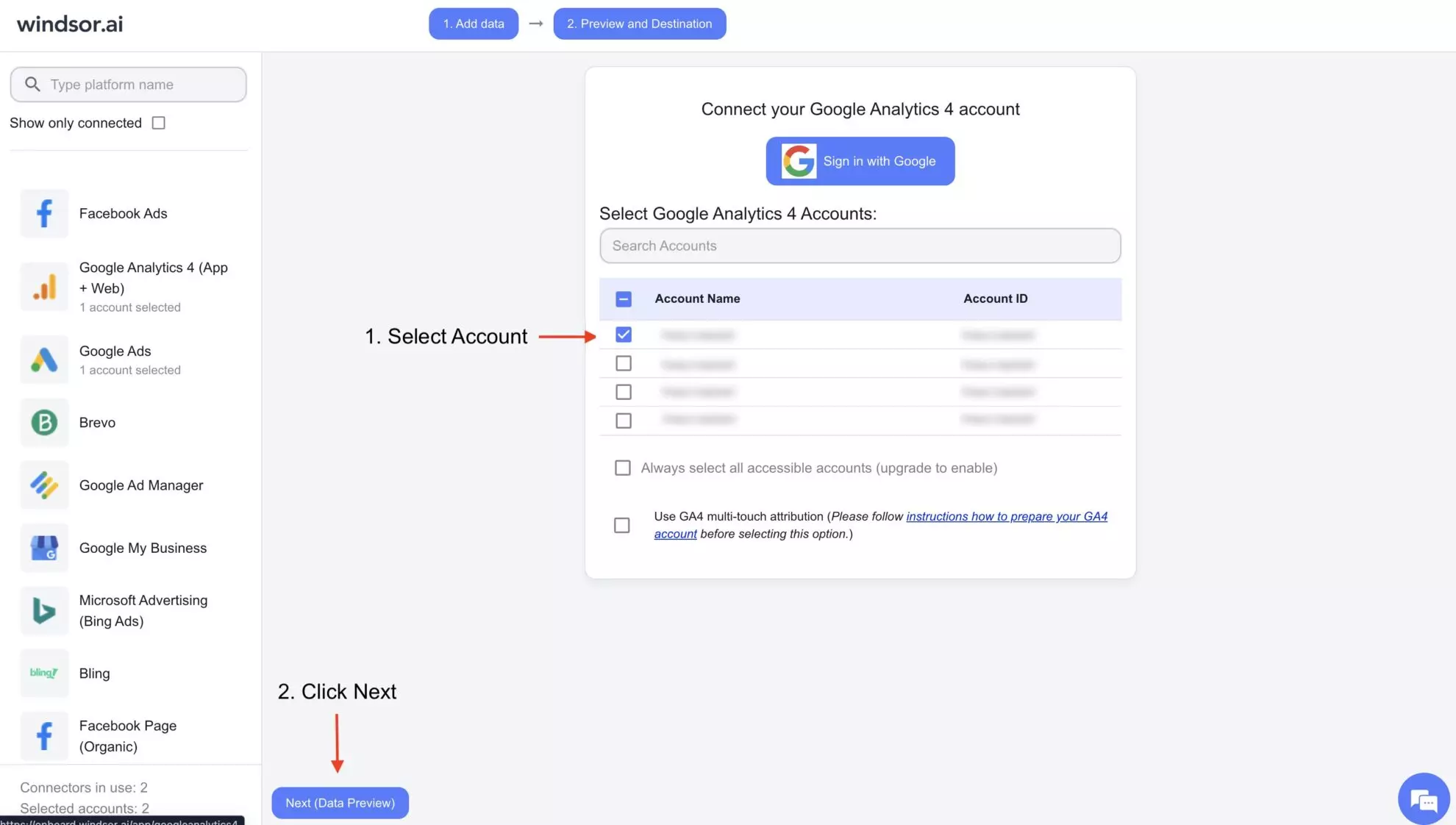
Connect a data source
In your Windsor.ai dashboard, connect the required data source and select the necessary accounts you want to pull data from.
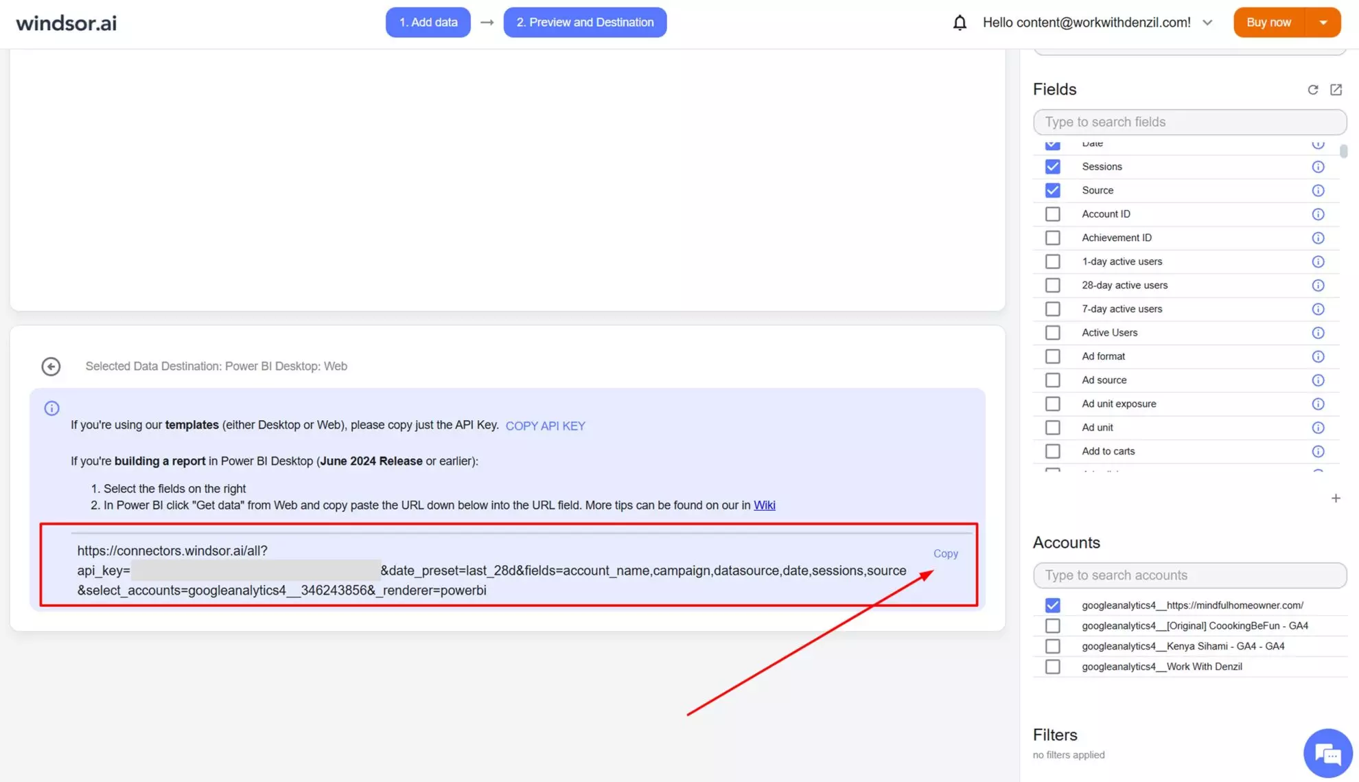
Connect the Power BI destination
Click on “Preview and Destination,” choose Power BI (Web or Desktop), and copy your API key.
Install the template
Download the selected template from the template page using the provided link and insert your API key on the start screen.
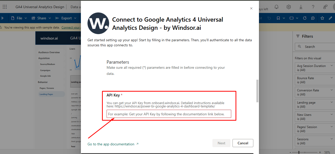
Update the template as necessary
Regularly use your dashboards and alter them as your objectives change over time.
Create professional reports with ease with Windsor.ai Power BI templates
With Windsor.ai Power BI templates, you can revolutionize how you handle and visualize your business data. Easily track key metrics and forecast trends, reducing the time you spend preparing data and focusing on making data-driven decisions, with these benefits:

Data connectivity
Data connectivity
You can integrate Power BI with hundreds of on-premises and cloud-based data sources. This includes popular sources such as Google Cloud applications, collaboration tools, cloud storage, marketing and customer relationship software, ERP, HR, and finance software. Windsor.ai helps you consolidate all your data into a single Power BI dashboard, allowing you to visualize KPIs, patterns, and trends in just minutes.

AI-powered insights
AI-powered insights
Power BI leverages AI capabilities to provide predictive analytics and advanced insights. The artificial intelligence models can detect patterns and trends as well as recognize relationships between variables that are presented to Power BI templates for visualization. This way, you get accurate information to make data-driven decisions.
Interactive dashboards
Interactive dashboards
Power BI enables you to create dynamic and interactive dashboards. Once you set up a dashboard, you can connect it to a live feed of raw data so that it updates automatically. It allows you to monitor your key metrics in real time so that you can make snap decisions based on solid information. Additionally, the dashboards can automate reporting on these key metrics to people who make decisions.

Data modeling engine
Data modeling engine
Raw data requires cleaning, shaping, and transforming so that you can make out what it means. Power BI has a robust data modeling engine that cleans and shapes this data to help create an accurate report. It also has tools that help you merge different datasets, manage relationships between data tables, and apply calculations.

Sharing and collaboration
Sharing and collaboration
Power BI simplifies how you share your insights and trends across departments and teams. It allows you to embed reports in apps and websites and share them via its platform. This way, stakeholders can interact with data conveniently without requiring you to update them every time the key variables change.
10 top Power BI dashboard templates and examples
With Windsor.ai’s extensive library of Power BI templates, it can be challenging to find the ones that best suit your unique business needs.
To simplify your choice, we’ve compiled a list of the most popular templates on Windsor.ai that are sure to be helpful:
1. Website analytics dashboard
This is one of the many Power BI dashboard templates used for visualizing data. It lets you evaluate how customers interact with your website by gathering website analytics data and presenting it in an easy-to-read format, allowing you to gain important insights and assess website performance against benchmark metrics.
Try Website Analytics Dashboard
2. Marketing dashboard
Using this dashboard from Power BI, you can generate marketing reports that highlight the findings of your marketing research. It helps you identify customer trends and develop strategies to meet their needs.
3. Social media dashboard
Here, you have a real-time dashboard that offers an overview of your team’s efficiency in influencing impressions on various social media platforms. You can also identify the most effective social networks and determine where to focus your marketing efforts.
4. Sales dashboard
The Power BI sales dashboard enables you to understand business performance by visualizing important metrics. This way, you can identify areas needing more attention to meet sales targets.
Try Sales Dashboard
5. Finance dashboard
The finance dashboard highlights key information, including profitability, revenue, expenses, and budgets, providing high-level insights into financial performance. This allows executive-level staff in your organization to make informed decisions on matters related to investments, budgeting, and resource allocation.
6. HR dashboard
You can capitalize on the HR Express dashboard available in Power BI to visualize employees’ demographics, monitor new hires, and ensure you meet diversity standards. It’s also possible to gain high-level insights related to average salary, age, and employment duration to understand who your employees are.
7. Logistics dashboard
With the assistance of logistics dashboards and the Power BI report builder, logistics managers within your organization can access important information on the flow of goods. As a result, they can pinpoint areas of high or low product flow and allocate resources more effectively.
8. Customer analysis dashboard
The Power BI customer analysis dashboard enables you to visualize your customers’ demographics and understand how they impact your relationship. Consequently, you can identify valuable and less valuable clients. This eventually helps you focus efforts on clients offering higher ROI.
9. Customer satisfaction dashboard
With this dashboard, you can learn how customers rate your products or services. The insights you get guide you in improving your operations to meet customer expectations and optimize customer satisfaction.
10. Executive dashboard
Power BI provides the executive dashboard, mainly designed for executive-level employees who want to understand business performance. Through this platform, you can monitor key metrics and determine if interventions are necessary to enhance or maintain specific performance metrics.
All the mentioned dashboards are accessible in the Data Galleries at the Power BI community portal.
FAQs
What is Power BI used for?
Power BI is used for data analytics, business intelligence, and visualization. With its impressive array of features, Power BI enables users to explore data, share insights, and collaborate with others to influence business growth and efficiency.
How to share a Power BI report?
There’s more than one way to share Power BI reports. You can publish them on the Power BI service, export as PowerPoint or PDF, send an email invitation to recipients, or publish on the web for public sharing using a URL.
How much does Power BI cost?
Power BI offers flexible pricing to suit different users—from individuals to large enterprises. There are four main tiers: Free, Pro, Premium Per User, and Premium Per Capacity.
Free Plan: Ideal for individual use. You can connect to over 100 data sources, publish reports, and create custom visualizations using Power BI Desktop. However, sharing and collaboration features are limited.
Pro Plan: Costs $14 per user/month. It includes all Free plan features, plus the ability to collaborate, share dashboards and reports, access app workspaces, and refresh data up to 8 times per day.
Premium Per User (PPU): Costs $24 per user/month. This tier adds larger data model support, more frequent refreshes (up to 48x/day), AI features, paginated reports, and deployment pipelines—without requiring full capacity licensing.
Premium Per Capacity: Starts at $4,995/month. It’s designed for large teams that need dedicated capacity and unlimited sharing without per-user licenses. It includes all Pro and PPU features plus on-premise reporting through Power BI Report Server.
Power BI free vs. Pro: what are the differences?
Most organizations find themselves choosing between the Free and Pro tiers when getting started with Power BI. The decision depends on the level of collaboration, sharing, and automation needed.
With a Free account, you can build and view reports using Power BI Desktop. It allows you to connect to over 100 data sources, create custom visualizations, and even get started with a free Microsoft Fabric (trial) account. However, sharing and cloud collaboration are not available.
The Pro plan includes everything in the Free version and adds key collaboration features. It allows up to 8 scheduled data refreshes per day, full sharing of reports and dashboards, and collaboration within workspaces. You can also export content in various formats and integrate with other Microsoft services like Teams and SharePoint.
Feature Comparison: Power BI Free vs. Power BI Pro
| Feature | Power BI Free | Power BI Pro |
|---|---|---|
| Cost | Free | $14 per user/month |
| Data Connectivity | 100+ data sources | 100+ data sources |
| Data Refresh | Daily manual refresh | Up to 8 automatic refreshes per day |
| Sharing | Not available | Share reports, dashboards, and datasets |
| Collaboration | Local use only | Collaborate in workspaces and apps |
| Export Options | Basic export options | Export to PowerPoint, Excel, PDF |
| AI Features | Limited | Full AI-powered insights |
| Integrations | Limited to personal use | Integrated with Teams, SharePoint, etc. |
What are the data sources you can connect with Power BI using Windsor.ai?
You can extract data from a wide range of sources, including Instagram, LinkedIn ads, Facebook pages, Google ads, Google Analytics, HubSpot, TikTok Ads, Amazon Ads, Stripe, Criteo, and 350+ more.
Tired of manual data exports into Power BI? Try Windsor.ai today to automate your reporting

