Introduction
Have you ever wanted to share interactive charts and graphs without having to create fully loaded dashboards? Or maybe you wanted to create a simple chart which you can share on your blog post or social media profile? A simple solution which requires just a few lines of code is using the Plotly open source library to visualize the details of your data. In this blog, we will be plotting an interactive Plotly Google and Facebook Ads bar chart with data retrieved from the Windsor API.
Requirements
All you need to have pre installed is python and pip. If both are already in your system, then open a terminal and install the following python libraries
pip install pywindsorai plotly pandas
Interactive Plotly Chart
The first thing we need to do is load the installed python libraries. We can do that by running
from pywindsorai.client import Client
import plotly.graph_objects as go
import pandas as pd
As mentioned above, I will be using ads click data and the easiest way to integrate multiple ad platforms into one place is by using the Windsor services. You can connect your services by going to the following url and creating a free account: https://onboard.windsor.ai/. Next, fetch the data
client = Client('your api key')
request = client.connectors(fields=['date','source', 'clicks','spend'])
dataset = pd.DataFrame(data=request["data"])
dataset.head()
>>>
	date 	        source 	     clicks 	spend
0 	2022-11-19 	facebook 	6 	6.89
30 	2022-11-19 	google 	        7 	1.929859
22 	2022-11-19 	google 	        2 	0.23322
33 	2022-11-19 	google 	        56 	3.944616
37 	2022-11-19 	google 	        0 	0.058551
Since the data we will be using is a time series, it is important to convert the string into a date object. Then, we can sort the data in an ascending order.
dataset["date"] = pd.to_datetime(dataset['date']).dt.date
dataset = dataset.sort_values("date")
We can create the chart by typing
fig = go.Figure()
fig.add_trace(
    go.Scatter(
        y=dataset["clicks"],
        hovertext=dataset["date"],
        line=dict(color="RebeccaPurple")
    )
)
To create the data source dropdown (facebook, google, all options), we can run
buttons = []
all_sources = list(dataset["source"].unique())
all_sources.append("All sources")
colors=["DarkOrange", "Crimson", "RebeccaPurple"]
for idx, source in enumerate(all_sources):
    filters =  dataset["clicks"] if source == "All sources" else dataset[dataset["source"] == source]["clicks"]
    buttons.append(
        dict(
            method="restyle",
            label=source,
            visible=True,
            args=[
                {
                    "y": [filters],
                    "type": "scatter",
                    "line": dict(color=colors[idx]),
                    "yaxis_title": ""
                },
            ]
        )
    )

menu = [
    dict(
        buttons=buttons,
        direction="down",
        showactive=True,
        x=1.0,
        y=1.11
    )
]
Lastly, update the axes, title and show the chart
fig.update_layout(
    showlegend=False,
    updatemenus=menu,
    title="Marketing Ad Clicks",
    xaxis_title="Click Point",
    yaxis_title="Number of Clicks",
    title_x=0.5
)
fig.write_html("chart.html")
fig.show()
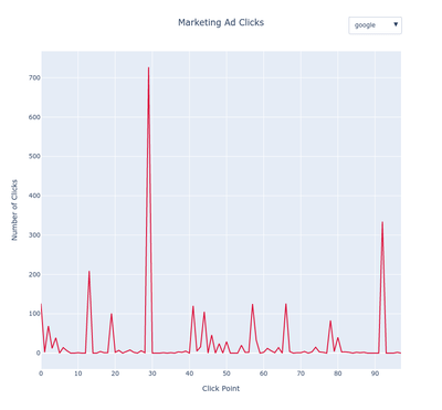
And voila, we have the following interactive Plotly chart
 Windsor vs Coupler.io


