Marketing Dash Application – Part 2: Plotly Dash App

Marketing Plotly Dash Application – Part 1: Reading Data
Introduction
After fetching our Facebook and Google Ads data, the next thing in mind is to start building the actual dashboard. As we have mentioned earlier, the framework we will be using is Plotly Dash. This platform is a mixture of Flask, React, and Plotly.js, and offers many modern UI elements making it very easy to build sophisticated dashboards. Their official website has an app gallery where they show various applications built using Plotly Dash. So, let’s get started.
Firstly, we start by specifying the app, server, and title for the application to work.
app = dash.Dash(__name__)
server = app.server
app.title = "Windsor.ai"
Layout
Then, let’s define our website’s UI; that is, the components which will be seen by the user on the browser
app.layout = html.Div(
    children=[
        html.Div(
            children=[
                html.Img(src="assets/windsor_logo.webp", className="header-emoji"),
                html.H1(
                    children="Windsor.ai Dashboard", className="header-title"
                ),
                html.P(
                    children="Analyzing ad data using Windsor.ai' services."
                    " Integration of Google and Facebook Ads using the API",
                    className="header-description",
                ),
            ],
            className="header",
        ),
        html.Div(
            children=[
                html.Div(
                    children=[
                        html.Div(children="Data Source", className="menu-title"),
                        dcc.Dropdown(
                            id="source-filter",
                            options=[
                                {"label": " ".join(source.split("_")).title(), "value": source}
                                for source in np.sort(dataset.datasource.unique())
                            ],
                            value="google_ads",
                            clearable=False,
                            className="dropdown",
                        ),
                    ]
                )
            ],
            className="menu",
        ),
        html.Div(
            children=[
                html.Div(
                    children=dcc.Graph(
                        id="clicks-chart", config={"displayModeBar": False},
                    ),
                    className="card",
                ),
                html.Div(
                    children=dcc.Graph(
                        id="spent-chart", config={"displayModeBar": False},
                    ),
                    className="card",
                ),
            ],
            className="wrapper",
        ),
    ]
)
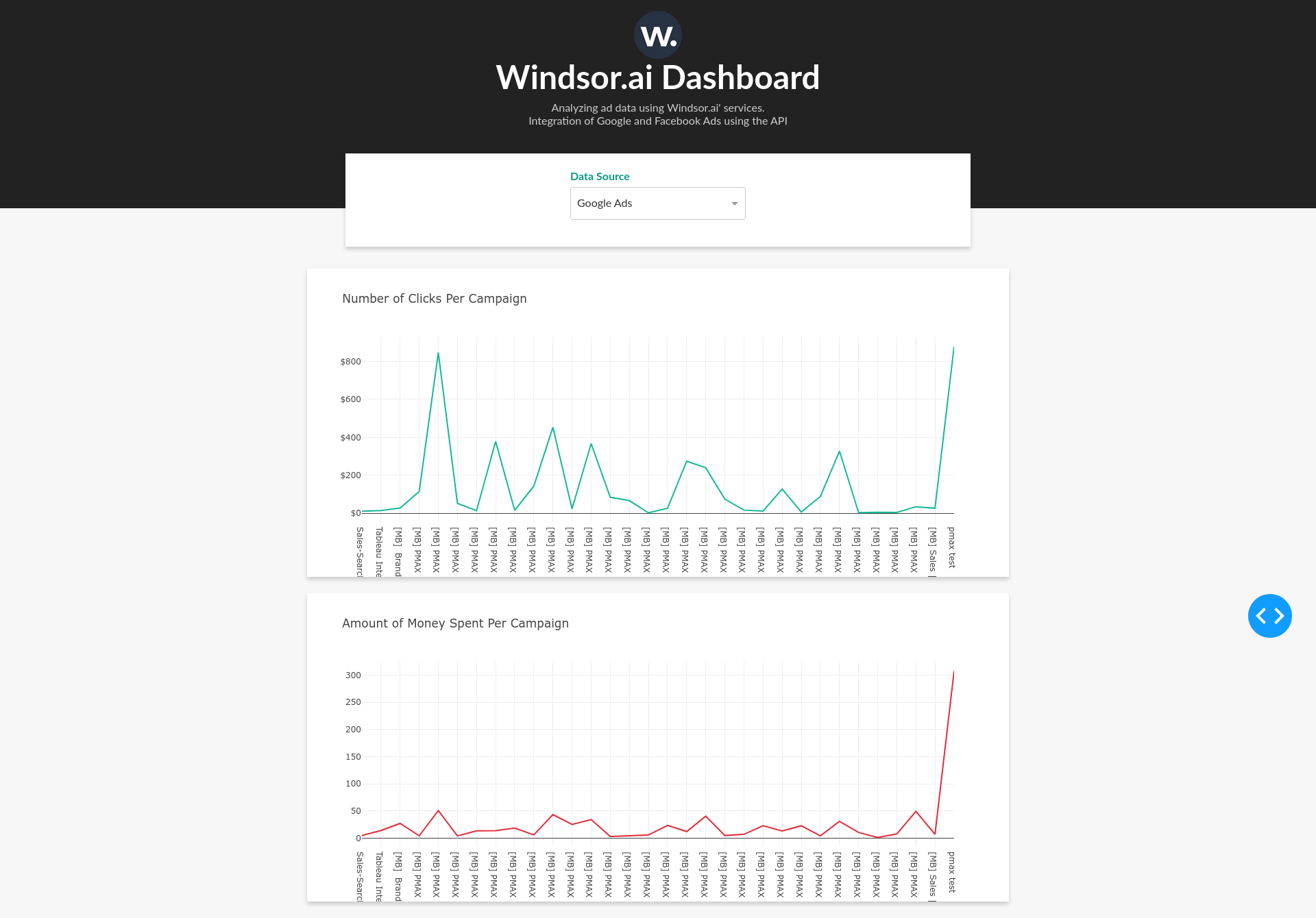
Since the UI code is a bit longer, let’s discuss some important points. The layout of the application actually builds proper html code. For example html.Div(children=”Data Source”, className=”menu-title”) returns an HTML div tag
<div class="menu-title"> Data Source </div>Moreover, we have defined a class called menu-title but we have not created a css file anywhere. To fix this issue, create a folder named assets in the same directory and add an empty file called styles.css. The reason we need to do this is because Dash will automatically load all the files in the assets folder when the dashboard loads. Add the following code in the styles.css file
.menu-title {
    margin-bottom: 6px;
    font-weight: bold;
    color: #079A82;
}
For the full css code, please visit the project repository. Another important fact is loading images. Similarly to styles, you can load an image by adding the corresponding file to the assets folder and then calling it in the code
html.Img(src="assets/windsor_logo.webp", className="header-emoji")The data source picker is simply built by calling the dcc.Dropdown function. We need to specify the options, which in this case are fetched from the dataset, id, default value, and class for styling.
dcc.Dropdown(
    id="source-filter",
    options=[
        {"label": " ".join(source.split("_")).title(), "value": source}
        for source in np.sort(dataset.datasource.unique())
    ],
    value="google_ads",
    clearable=False,
    className="dropdown",
)
Interactivity
Ok, now let’s build the interactive side of the dashboard. In order to update charts whenever the user clicks the dropdown, we need to create a function and decorate it with the app.callback decorator. In our case, we want to update clicks-chart and spent-chart whenever the source-filter input has changed. To do that, we add the following lines of code
@app.callback(
    [Output("clicks-chart", "figure"), Output("spent-chart", "figure")],
    [
        Input("source-filter", "value"),
    ],
)
def update_charts(source):
    mask = (dataset.datasource == source)
    filtered_data = dataset.loc[mask, :]
    clicks_chart_figure = {
        "data": [
            {
                "x": filtered_data["campaign"],
                "y": filtered_data["clicks"],
                "type": "lines",
                "hovertemplate": "$%{y:.2f}<extra></extra>",
            },
        ],
        "layout": {
            "title": {
                "text": "Number of Clicks Per Campaign",
                "x": 0.05,
                "xanchor": "left",
            },
            "xaxis": {"fixedrange": True},
            "yaxis": {"tickprefix": "$", "fixedrange": True},
            "colorway": ["#17B897"],
        },
    }

    spent_chart_figure = {
        "data": [
            {
                "x": filtered_data["campaign"],
                "y": filtered_data["spend"],
                "type": "lines",
            },
        ],
        "layout": {
            "title": {"text": "Amount of Money Spent Per Campaign", "x": 0.05, "xanchor": "left"},
            "xaxis": {"fixedrange": True},
            "yaxis": {"fixedrange": True},
            "colorway": ["#E12D39"],
        },
    }
    return clicks_chart_figure, spent_chart_figure
The only important part in the code above are the @app.callback decorator and the dataframe filter mask = (dataset.datasource == source). The rest are mostly styling for the charts.
Lastly, add the following lines in the end of the file to tell python that this is a runnable script
if __name__ == "__main__":
    app.run_server(debug=True)
Just to be sure that the code has been copy-pasted successfully, compare it with the one in the GitHub repository.
To test the dashboard locally run
python app.py
 Windsor vs Coupler.io

