 AI insights
 About us
 Careers
 Security
 Customer reviews
 Contact us
 Affiliate program
 Solution partners
 Looker Studio templates
 Tableau templates
 Facebook Ads templates
 Google Ads templates
 Data fields & Metrics
 AI prompt library & Guides
 Product documentation
 API documentation
 Case studies
 Blog
Blog Data models
 Windsor vs Supermetrics
 Windsor vs Fivetran
 Windsor vs Portermetrics
 Last updated: 21 May 2025
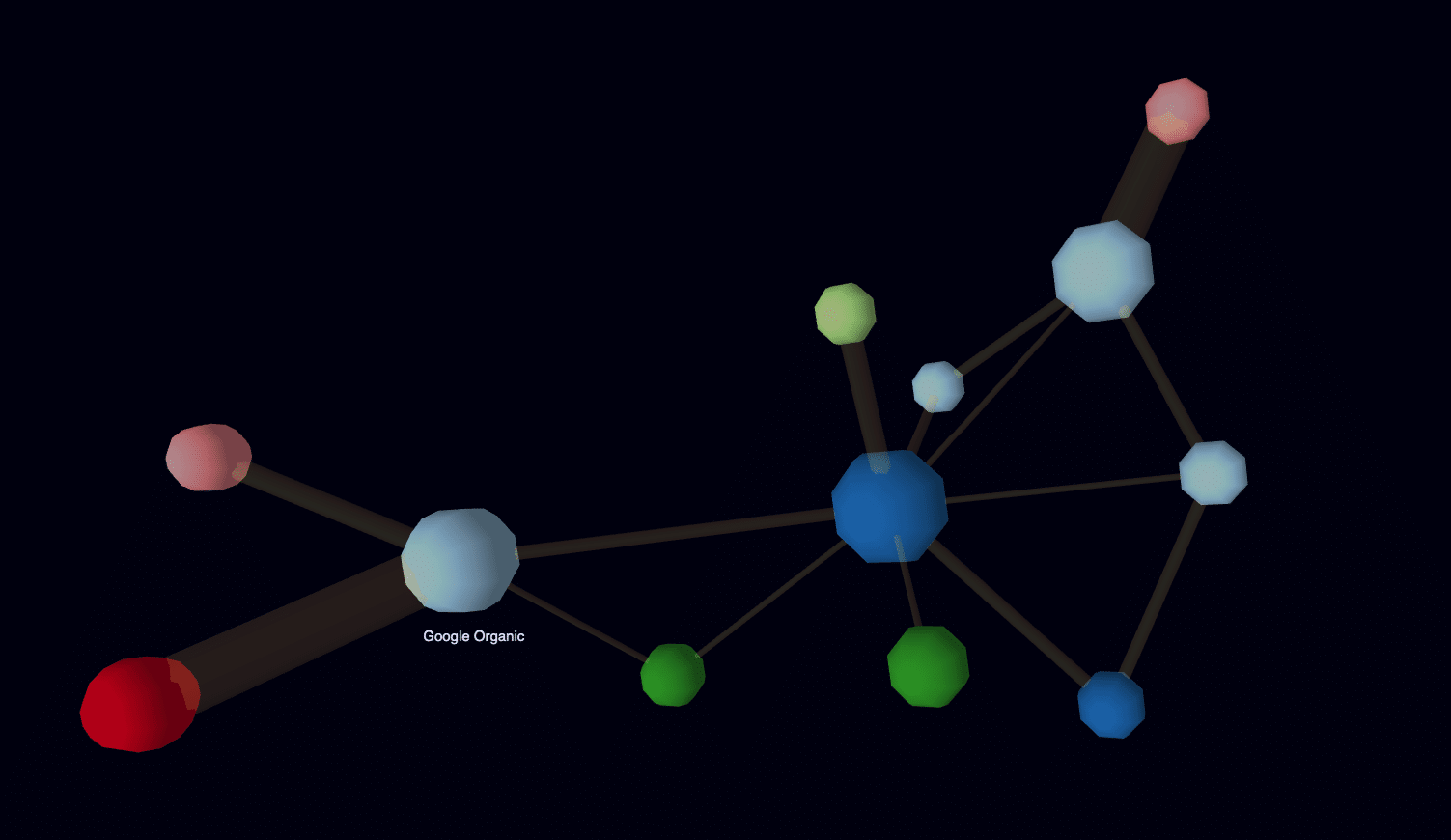

In this article we will analyse online customer journeys in 3D with 3D force graphs.
Why does customer journey analysis matter for marketing attribution?
At windsor.ai we focus on attribution modelling. You might wonder what that is. Specific to marketing this means our algorithms analyze customer journeys and measure the impact of the different marketings touchpoints along the customer journeys. Marketing attribution is a very difficult but also a topic with very large financial interests as every advertising platform wants to show themselves as contributing with as many conversions as possible.
We typically provide our users with data on attributed revenue or conversions per marketing touchpoint on multiple different granularities. Both on channel level (eg. Google CPC, Facebook) but also down to keyword level. Then this attributed value is matched with the spend on that particular touchpoint so that the users get an ROI that is already actionable as one wants to shift the budget to those touchpoints with high ROI.
Many of our users have been interested in drilling deep into the customer journeys to understand them in depth. This is not only because of curiosity but also to be able to double-check the data for correctness and also to gain more confidence in taking significant decisions on marketing planning and budget adjustments.
Being able to drill down gives you the confidence to trust the numbers and act on the data. Only at this point does the data become valuable:)
Analysing online customer journeys in 3D
From Sankey to interactive 3 graphs
The traditional way to analyze customer journeys has been the Sankey Graph.
Example:

We realised this does not provide enough detailed information about the customer journeys and is not interactive so we started looking for an alternative and a 3D force graph provides the interactive chart many of our users were looking for.

Creating the charts in our case was quite easy as we already have the data in customer journey format. For this we needed to re-structure the data a little bit.
We needed to separate the data so we have it in one dataset containing the nodes in the graph and the other the links.
Here is an example of the dataset below.
{"nodes": [{"id": "Google CPC", "group": 1, "size": 10},{"id": "Google Organic", "group": 1, "size": 7},{"id": "Facebook", "group": 1, "size": 2},{"id": "Conversion", "group": 2, "size": 12},{"id": "Admeira", "group": 3, "size": 1},{"id": "Blick.ch preroll", "group": 4, "size": 2},{"id": "Goldbach Audience Network", "group": 4, "size": 2},{"id": "Google Display", "group": 1, "size": 2},{"id": "Capture Media", "group": 2, "size": 2},{"id": "20 minuten.ch", "group": 5, "size": 2},{"id": "comparis.ch", "group": 5, "size": 3},{"id": "Email", "group": 6, "size": 3}],"links": [{"source": "Google CPC", "target": "Conversion", "value": 1},{"source": "Facebook", "target": "Google CPC", "value": 2},{"source": "Admeira", "target": "Conversion", "value": 3},{"source": "Blick.ch preroll", "target": "Conversion", "value": 1},{"source": "Blick.ch preroll", "target": "Google Organic", "value": 1},{"source": "Facebook", "target": "Conversion", "value": 1},{"source": "Goldbach Audience Network", "target": "Conversion", "value": 1},{"source": "Google Display", "target": "Conversion", "value": 2},{"source": "Capture Media", "target": "Conversion", "value": 2},{"source": "Capture Media", "target": "Facebook", "value": 2},{"source": "Google Display", "target": "Google CPC", "value": 2},{"source": "Google Organic", "target": "Conversion", "value": 2},{"source": "20 minuten.ch", "target": "Google Organic", "value": 3},{"source": "comparis.ch", "target": "Google CPC", "value": 8},{"source": "Email", "target": "Google Organic", "value": 8}]}
The https://neo4j.com/ graph database is great for storing the data and serving it for the visualisations.
The 3D-charts provide very detailed information about customer journeys in one easy view. The size of the nodes shows the number of visitors that converted via that touchpoint and its possible to zoom in to see very detailed information.
In the future we will add some small details to the visualisations probably inserting images for the nodes for the most common marketing touchpoints but the feed-back sofar on the visualisations is very nice.
Let us know what you think!


