 AI insights
 About us
 Careers
 Security
 Customer reviews
 Contact us
 Affiliate program
 Solution partners
 Looker Studio templates
 Tableau templates
 Facebook Ads templates
 Google Ads templates
 Data fields & Metrics
 AI prompt library & Guides
 Product documentation
 API documentation
 Case studies
 Blog
Blog Data models
 Windsor vs Supermetrics
 Windsor vs Fivetran
 Windsor vs Portermetrics
 Last updated: 13 April 2026

Introduction to Tableau Conditional Formatting
Tableau conditional formatting helps you highlight patterns and trends in your customized data visualizations. You get more control over your data visualizations using the Tableau conditional formatting features.
You can create rules that determine how Tableau conditional formatting individual cells are formatted according to their contents, how it looks, or even what happens when specific actions occur.
The good thing is that you don’t need to learn complicated programming languages to start manipulating your charts.
Have you ever wanted to create a conditional formatting rule within a data visualization platform? Maybe you want to highlight certain categories, create a Tableau text table or highlight rows within a chart.
Or perhaps you’re looking to highlight table Tableau and turn text into links or images depending on whether they contain specific keywords. If yes, then you’ve come to the right place!
This guide discusses Tableau conditional formatting, including how to modify rows and columns, data, colours, and text in Tableau.
Table of content
How to conditionally format the size & colors of measures in Tableau?
- FAQs: Simple Conditional Formatting in Tableau
What is Tableau?
Tableau is a business intelligence and visual analytics tool revolutionizing how we utilize data to address issues by enabling individuals and companies to maximize their marketing data.
The Tableau platform allows businesses to make data-driven decisions quickly and seamlessly in a way that clients and consumers can appreciate. It consists of tools such as Tableau filters, Tableau Conditional Formatting, and Charts in Tableau to help with your analysis.
With it, you can connect to any data source. You can analyze, organize, manage, and understand your marketing data by visualizing information more efficiently than spreadsheets and charts.
You don’t need any programming skills to learn to use Tableau.
Tableau software enables users to connect to various data sources like Salesforce to Tableau connector.. You can easily integrate data sources and display millions of marks in one visualization.
Here are some key features:
Easy integration with multiple data sources
Tableau offers various data sources from which you can connect and retrieve data. In addition to On-premise files, spreadsheets, relational databases, non-relational databases, Data Warehouses, Big Data, and On-cloud data, Tableau supports various other data sources.
Tableau can securely connect and blend data from multiple sources to create a visual combinatorial view of data. Tableau is also compatible with multiple data connectors, including Presto, MemSQL, Google Analytics, Google Sheets, and others.
Enhanced visualizations
Tableau offers a wide variety of visualizations, from simple ones like bar charts and pie charts to more complex ones like histograms, Gantt charts, choropleth maps, heat maps, bullet charts, motion charts, treemaps, and boxplots. Any visualization can be chosen from the Show Me tab’s visualization type section.
While Tableau excels at automating complex charts, there are times when users need a more curated narrative for a high-stakes meeting and think, “I should hire someone to do my PowerPoint presentation.” In these instances, professional essay help and specialized writing services fill the gap by providing the human writing touch necessary to turn raw data into a persuasive story. While AI and BI tools handle the numbers, human insight ensures the message is clear, empathetic, and tailored to the specific audience.
Robust security and data protection
Tableau offers security and data protection. Its security system is based on authentication and permission systems for data connections and user access. The use of row-level filtering improves data security. Users can also connect to security protocols like Active Directory, Kerberos, etc.
Live and in-memory data
Tableau ensures that in-memory data is integrated from both live data sources and data extraction from external data sources. As a result, you can use data from various sources without restriction.
By establishing live data connections or storing the data in memory, you can use data straight from the data source. According to their requirement, many types of Tableau filters can extract data from a data source.

Try Windsor.ai today
Access all your data from your favorite sources in one place.
Get started for free with a 30 - day trial.
Cross-database join
Tableau recently added a new “Cross-Database Join” feature that makes it considerably quicker and less technically complex.
Cross-Database allows Data sources to combine data from different databases, which is then created and published so other Tableau users can produce reports.
Mobile view
The mobile version of the software is available. You can do pretty much everything that you do on the desktop version. You can create mobile-friendly dashboards and reports.
You can also design mobile dashboard layouts unique to your mobile device. This function gives you a great deal of freedom and convenience when managing your data.
What is Tableau conditional formatting?
Tableau conditional formatting is a feature that allows users to apply specific formatting rules based on data values. This means you can dynamically change the appearance of data points as they move through a chart or visualize numeric values depending upon other variable criteria.
In many cases, when you need to classify data during your analysis quickly, Tableau conditional formatting helps you understand quickly the significant differences, which can then be used to make critical decisions in the context of the problem.
The ability to quickly identify which data points meet specific criteria using colors and symbols is invaluable when developing dashboards, reports, or business intelligence applications within the Tableau platform.
Tableau conditional formatting process
A conditional formatting process is used to create rules or formulas based on data values. The rules look for certain criteria and then format cells based on those conditions.
Most often, when Tableau users perform visual analysis on data, they use conditional formatting to highlight changes in trends or patterns.
By default, Tableau only allows rows or columns to be sorted. However, with custom sorting functions, you can sort on multiple fields simultaneously.
You can implement conditional formatting in Tableau using distribution volume data, size, and colours measures based on parameters, as will be discussed further in this post.
How to conditionally format the size and colors of measures in Tableau
By design, measures in Tableau have the same format, whether positive or negative. So, if you were to change the size of the measure, then the percent values would also become larger.
Likewise, if you choose to change the colors of the measure to blue, that is, if most of the changes were positive, then the percent value would also be blue even though its change was negative.
The easiest way to conditionally format both the size and colors of measures is to make calculated fields in Tableau for each text element you need to format.
Each calculated measure can be set up to display only when a particular criterion is met by utilizing the Immediate IF (IIF) function (i.e., a positive change). Since each measure will generate its text for the chart, each can be formatted independently.
Change Color of 1 Column in Tableau
Color, a column chart, is the main use case for coloring a single column in a circumstance where you have numerous columns in a view and you just want to change the colors of one.
Let’s see how to do this in Dimensions and Measures.
Dimensions
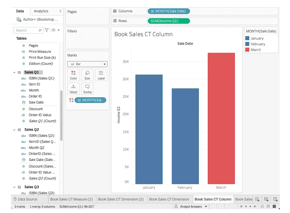
Consider that we want to display a column chart of the monthly sales for the first quarter, which includes January, February, and March.
To change the colors for one month, drag the desired dimension to the color mark as shown below.
Measures
Alternatively, in Tableau conditional formatting one column, you could also choose to use a measure for coloring. However, dragging a measure to the colours mark will result in a colours spectrum (because a measure is continuous).
It would appear as shown in the image below:

Modifying rows & columns
With the help of Conditional Formatting Tableau features, modifying rows and columns can easily be done, which helps you get a better understanding of your marketing data.
Generally, condition formatting is done using Microsoft Excel. However, you can do the same in your Tableau analysis, but it is not as straightforward.
Follow the steps below to accomplish this in Tableau Conditional Formatting:
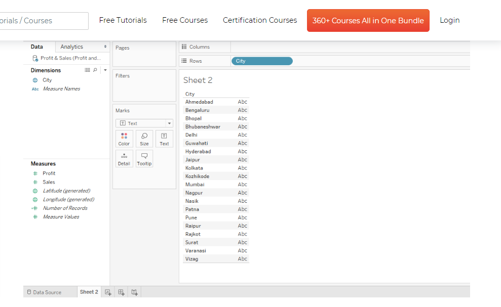
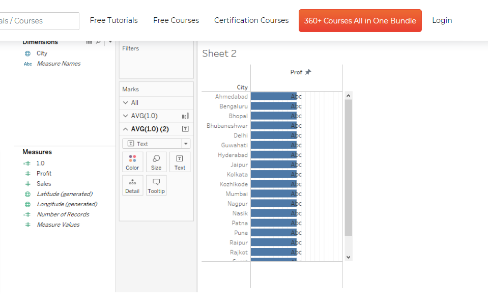
- Step 1: Twenty major Indian cities’ sales and profit numbers are included in our data for this example. The data has been loaded into Tableau.
When we switch to the sheet tab, we can see the two measurements, Profit and Sales, and the single dimension City included in each part.
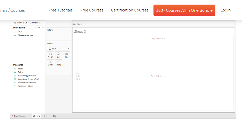
- Step 2: To start, drag dimension City into the Tableau conditional formatting Rows section as shown below.
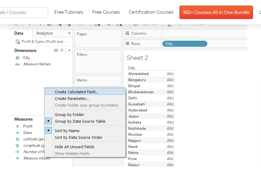
- Step 3: Next, create calculated fields in Tableau, as shown below.
- Step 4: Create a calculated field designated “1.0” and enter “1.0” in the code section. This field appears in the Measures section when created, as seen in the image below.
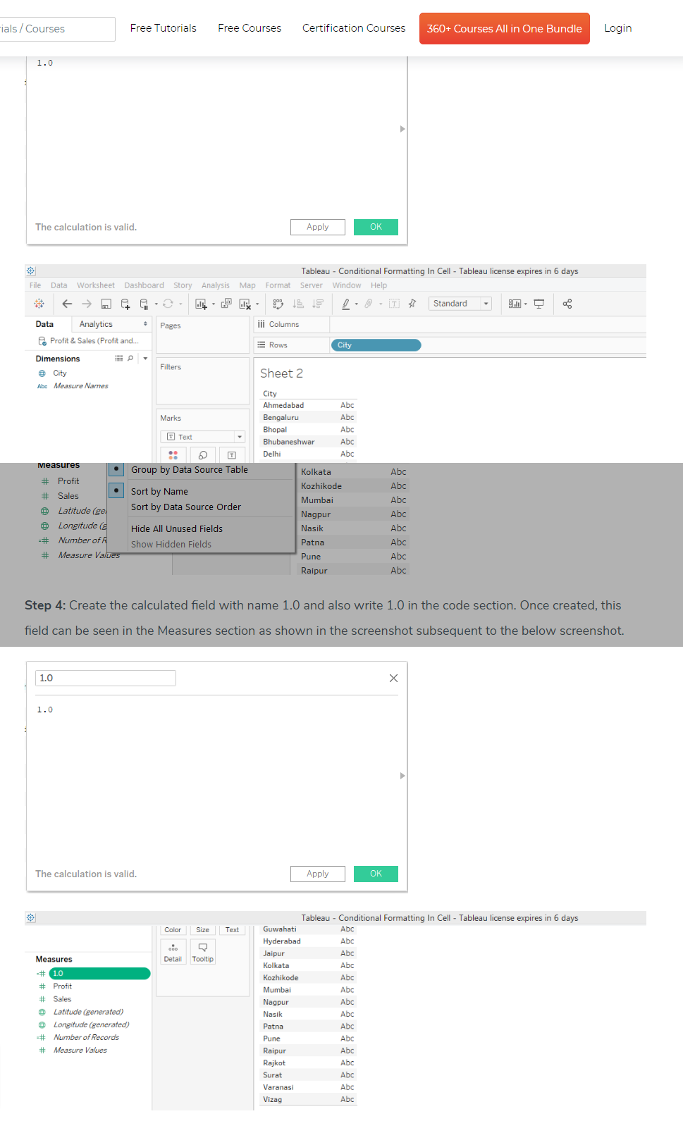
- Step 5: Drag the calculated fields in Tableau 1.0 values individually into the Columns area. Type 1.0 should be changed to AVG (Average).
Choose Average in Measure from the field’s dropdown menu to do so.
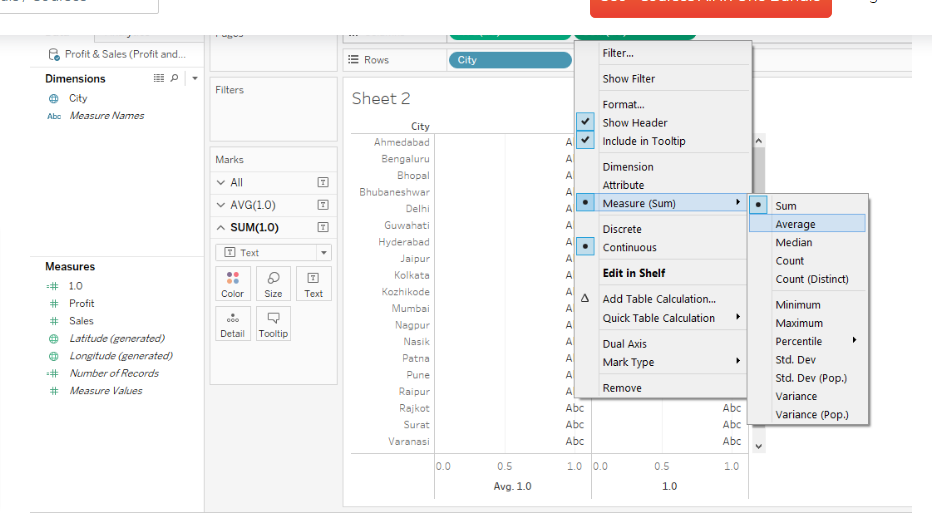
- Step 6: Select “Dual Axis” from the dropdown menu of the second 1.0 measure. This is shown in the screenshot below.
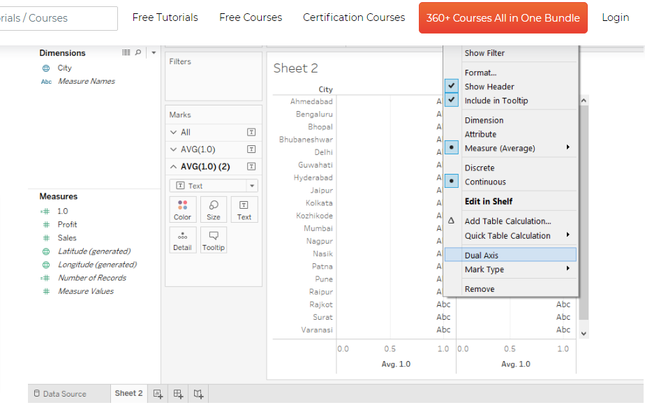
- Step 7: Next, you will modify the top and bottom axis by right-clicking on the top and selecting “Edit Axis,” a dialogue window will pop up, as seen in the screenshot below.
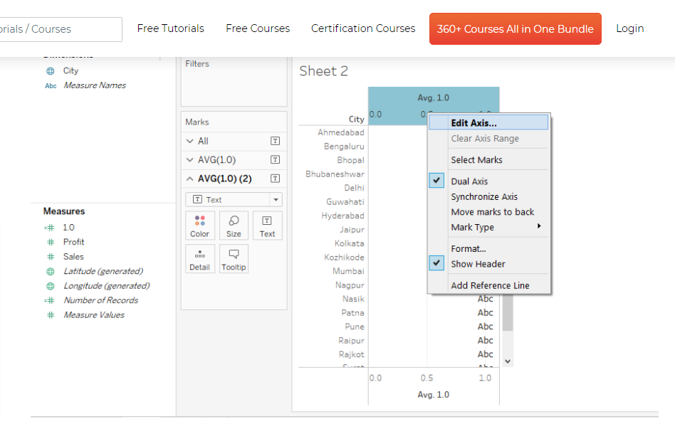
- Step 8: The Edit Axis dialogue box’s default options and values are displayed in the image below.
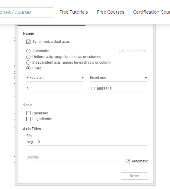
- Step 9: Make sure the modifications are done as indicated below in the “General” section of the “Edit Axis” dialogue box.
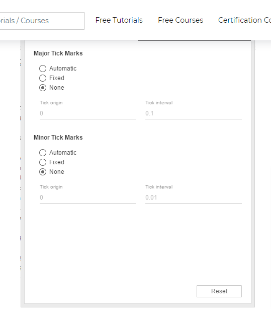
- Step 10: Select “None” for both Major and Minor Tick Marks in the dialogue box’s “Tick Marks” section.
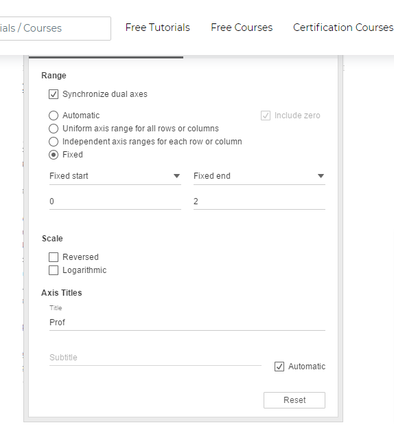
- Step 11: Changes to the bottom axis’ General and Tick Marks sections are similar to those made to the top axis, with the exception that the General section’s title is left blank, as shown below.

- Step 12: The steps above for Tableau Conditional Formatting results in the following visualization. Because we have a value of 2 in the “Fixed end” field of the Edit Axis dialogue box and a value of 1 in the 1.0 field, the blue bars are half the size of the cell.
- Step 13: Next, double-click the first 1.0 measure pill and add 1 as indicated below to get full-size bars.

- Step14: The steps mentioned above give us full-size in-cell bars, as seen in the figure below.

- Step 15: At this point, drag Profit over Color for the first 1.0 field in the Marks Card. This results in various colored bars. Please note that the different colored bars represent the various Profit measure values.
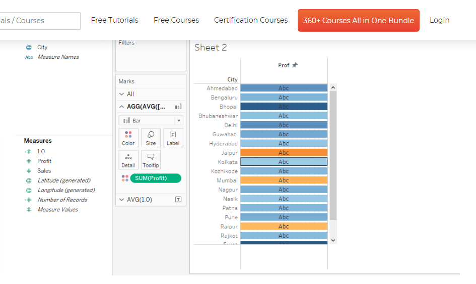
- Step 16: Next, drag the Profit card over the Tableau conditional formatting Text in Marks card in the second 1.0 measure to display values in the cells, as shown below.
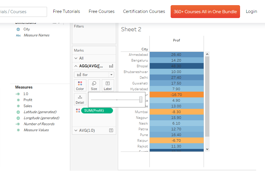
- Step 17: From the image above, you can see that the colors have not filled the cell. If you want the colors to fill the entire cell, choose the largest size by moving the size slider for the first 1.0 field to the rightmost position.
Below is an illustration of that.
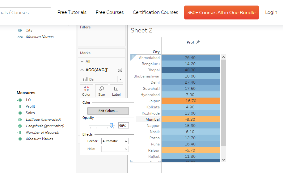
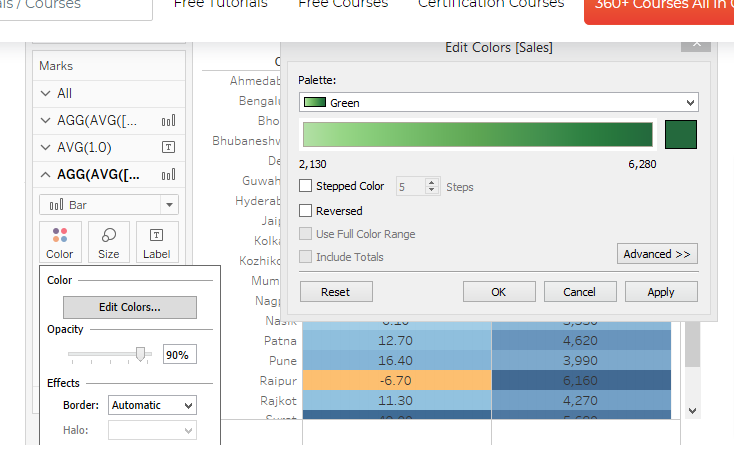
- Step18: If the brightness of the background colours is intense, you can lessen it by adjusting the opacity through the Opacity slider in the Color section. In this instance, the opacity was maintained at 90%.
Similarly, modifying the parameters in the second 1.0 measure may change the opacity for text values.
Ensure that text values stand out over the backdrop colours; the opacity for text values should be kept at 100%.
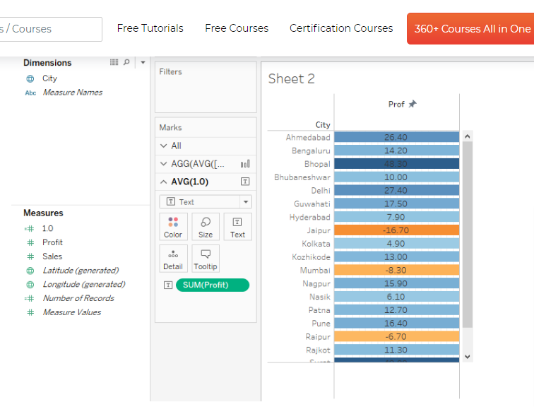
Also, note that negative Tableau conditional formatting numbers may be easily separated from positive ones in the image below. Orange is used to signify negative values, whereas blue is used to show positive ones.
Additionally, the brightness of the hue varies depending on the value.
- Step 19: The steps mentioned above were taken for the Profit measure. Sales is another significant metric in the dataset. To analyze measuring Sales. Repeat the steps mentioned earlier.
Switch the colors for Sales to Green, as seen below, or choose another appropriate color.
- Step 20: Now that the conditional formatting Tableau measure values analysis you conducted appears as shown in the image below. You can see the Tableau conditional formatting text colors assigned on the right side according to the range of Profit and Sales figures.
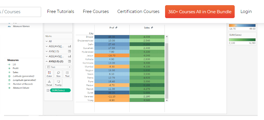
- Step 21: The preceding image shows a more in-depth perspective of the analysis you completed using conditional formatting.

Modifying data
Data is easier to modify and process with the Tableau Conditional Formatting feature. This makes data more readable.
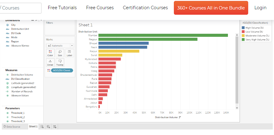
When modifying data, the aim is to classify distribution units based on their volume of distribution using the Tableau Conditional Formatting feature. You’ll split them into high, moderate, and low volume distribution units.
Follow the steps below to modify the data.
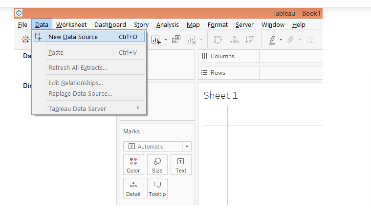
- Step 1: To load the data source, select “New Data Source” from the Data menu to load the data source. You can also select “Connect to Data.”
- Step 2: Now select the relevant data source type in the “Connect” section. It reads “Microsoft Excel” in this instance. After that, load the data.

- Step 3: The loaded data can be seen in the “Data Source” tab, as shown in the image below

- Step 4: By switching to the sheet tab, you can examine the dataset’s dimensions and measures. They can be found in the relevant sections.

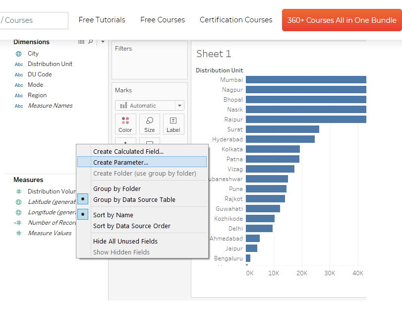
- Step 5: Drag the dimension Distribution Unit into the Rows region and the Distribution Volume dimension into the Columns region to start. As seen below, a horizontal bar chart is generated.
If the preset chart type is different, Choose a bar chart in “Show Me.”
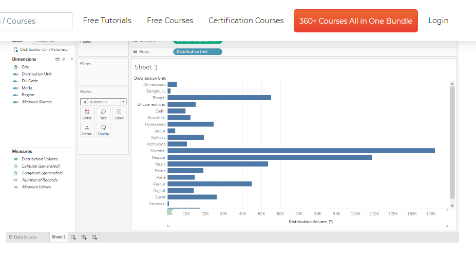
- Step 6: You can sort the results in decreasing order by hovering your cursor over the sort icon, as seen in the screenshot below.

- Step 7: The next step is to define three parameters that will aid you in achieving your objective. The parameters will primarily aid the segmentation of distribution units based on distribution volumes.
Right-click anywhere in the space of the Data section and choose “Create Parameter” from the menu that displays, as shown below, to create the first parameter.
- Step 8: The “Create Parameter” dialogue box appears after performing the steps above, as seen below.

- Step 9: As shown in the image below, make the modifications listed below in the “Create Parameter” dialogue box. Change the name to “Threshold 1,” maintain the data type “Float,” set the current value to 100,000, and choose “Automatic” for the Display format and “All” for the “Allowable values.”
To create the parameter, click OK to complete the process.

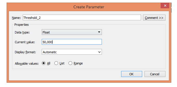
- Step10: Next, create the second parameter and name it “Threshold_2”, set the Current value to 50,000, and enter the other details set as shown below.
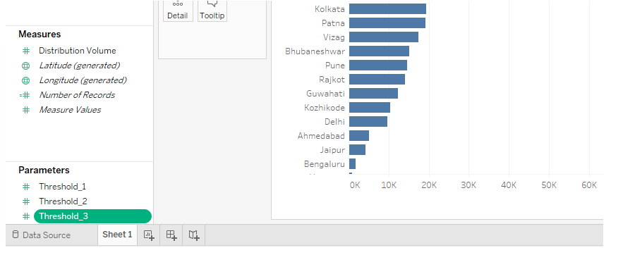
- Step 11: Finally, create the last parameter last. Simply call it “Threshold 3.” Set the other details as indicated below, with the current value of this parameter set to 25,000.

- Step 12: The screenshot below illustrates the three parameters you created. You will now use them effectively to accomplish your goal.
- Step 13: To appropriately classify the distribution units based on distribution volume, the parameters we produced must be used in a computed field. Therefore, you’ll create a calculated field next.
To do this, right-click anywhere in the Data section’s space and select “Create Calculated Field in Tableau.”

- Step 14: In that case, we can simply change the current threshold value for Threshold 1 from 100,000 to 200,000 without altering the code’s value in the computed field.
The code classifies a distribution unit as a “Very High Volume DU” if its value exceeds Threshold 1 or 100,000. It will also carry out the other classes similarly.
Note: You did not use hard code for the values in the field because doing so would prevent us from managing context-based changes. If you have parameters at your disposal, as the context adjusts, the calculated fields in Tableau will update to reflect the new values of the parameters.
For example, suppose you want to classify distribution units with distribution volumes exceeding 200,000 as Very High Volume DUs. In that case, we can change the current threshold value for Threshold 1 from 100,000 to 200,000 without altering the code’s value in the computed field.

- Step 15: The screenshot below shows that the calculated field “DU Classification” displays under Measures.
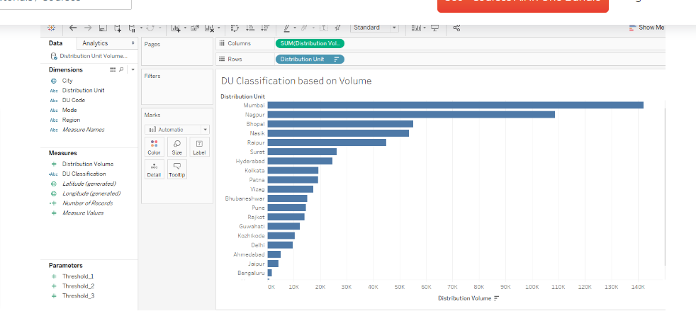
- Step 16: Drag the calculated field “DU Classification” over Colour in Marks. The Distribution Units will be divided into four groups according to their volume contribution, as shown in the screenshot below.
You can see the categories on the right side of the screenshot.
- Step 17: Review the visualization by Tableau conditional formatting in more detail. You may also rearrange the categories in the legend by simply dragging a particular category up or down using the mouse.
The categories now appear to be in the correct sequence in the legend.

- Step18: Lastly, you can modify a category’s colors. Select the necessary colors by clicking on “Edit colors” after selecting “Color” in the Marks card.

Try Windsor.ai today
Access all your data from your favorite sources in one place.
Get started for free with a 30 - day trial.
Difference between Tableau measures vs. dimensions
When you import any data from any data source, each field gets separated into two main components designated as dimensions and measures based on the data it consists of.
The fields can be used to build data views.
Dimension and measure are crucial components in Tableau analysis and visualization.
Dimensions are the qualitative values that can be used to categorize and describe data points, while measures are the quantitative values that are used to represent data in Tableau conditional formatting measure values.
Below is a table comparing the difference between tableau conditional formatting text.
Dimension | Measure |
It is an independent variable. | It is a dependent variable. |
It is not dependent on the measure. | It is dependent on the dimensions. |
Adding to the filter will give us insight into the data, so it is advantageous if it is added to filters. | Adding to the filter won’t give us enough insight into the data. |
It contains duplicates of the data. | It does not contain duplicates of the data. |
It cannot be aggregated. | It can be aggregated. |
It consists of qualitative and categorical information | It consists of quantitative data. |
It is used to compare the data. | It is a metric value that is used to compare the dimension. |
Min, Max, and Sum won’t work. | Min, Max, and Sum will work. |
It will show the header Tableau when dimensions are added to the rows or columns. | Axes are generated when added to the rows and columns. |
It is impossible to get a number of records because aggregation does not apply to it. | The number of records present in the database can be determined no matter how huge the dataset is due to the aggregation of features. |
If the numeric field is the dimension, it can be treated as the measure. | The numeric field can be treated from measure to dimension. |
Longitude and Latitude measures are not present. | Longitude and Latitude measures are present for the geographic dimension. |
It can describe data records. | It cannot describe data records. |
It can be continuous and discrete. | It cannot be discrete and continuous. |
Conclusion
From our discussion above, you can see how helpful the Tableau platform is in helping you analyze and visualize your marketing data seamlessly. We showed you how conditional formatting in Tableau is done using various illustrations, including how to change the colours of 1 column in Tableau, modifying rows & columns, and modifying data.
As a highly interactive visualization tool, Tableau can be used without restrictions to a specific format. So, to conduct a thorough performance study of your company, it is crucial to unify the data you collect and manage across many applications and databases.
This can be done by allocating some of your technical capacity to the tasks of integrating data from all sources, cleaning and transforming it, and then loading it into a Business Intelligence tool like Tableau.
However, this is somewhat a long method; alternatively, you can easily do this via Windsor.ai, which simplifies these processes and helps marketers connect all their data in one place using our custom connectors, in this case, Windsor.ai Tableau connector.
Sign up today on Windsor.ai to claim your 14-day free trial.
FAQs: Simple Conditional Formatting in Tableau
How to add conditional formatting in Tableau?
Create a view first, listing the appropriate field’s row values. Then, add number of records fields rather than measurements to the columns shelf and set the aggregate to min so that all the bars equal 1.
If you want to construct a crosstab Tableau with 2 measures at the end, add 2 number of records fields. Next, right-click each axis and set a fixed range of 0 to 1 so that the bars appear to occupy a whole row (it is a bar).
Customize the labeling and formatting of the rows to look like a conditionally prepared cross tab Tableau in Excel. Lastly, add unique KPIs and data labels to the corresponding mark cards.
Can you do conditional formatting in Tableau?
Yes, you can. Although Tableau’s conditional formatting cannot be applied across a column like it can in Excel; instead, it can only be done across a mark.
When measures are put to the Tableau conditional formatting rows/columns shelf, marks are produced. A user can create a conditionally styled crosstab in Tableau that resembles Excel by adding these extra marks.
How do you conditionally format text in Tableau?
In each mark card, drag the corresponding measure to Text and Color. Drag Sales to Text, for instance, in the SUM(Sales Col) mark card.
You can choose any colors you want for each measure. Under the Tick Marks box, choose “None” for both Major and Minor tick marks, then click OK.
Read also:
Tableau vs Power BI: An In-Depth Comparison
Free Tableau Templates in 2023
How to Integrate BigQuery Into Tableau

