 AI insights
 About us
 Careers
 Security
 Customer reviews
 Contact us
 Affiliate program
 Solution partners
 Looker Studio templates
 Tableau templates
 Facebook Ads templates
 Google Ads templates
 Data fields & Metrics
 AI prompt library & Guides
 Product documentation
 API documentation
 Case studies
 Blog
Blog Data models
 Windsor vs Supermetrics
 Windsor vs Fivetran
 Windsor vs Portermetrics
 Last updated: 19 March 2026

In Power BI, there are many different types of charts and visualizations that you can use to display your data. Some of the most commonly used chart types include column and bar charts, line charts, and pie charts. These chart types are useful for showing different types of data and trends, and they can help you quickly and easily identify patterns and relationships in your data.
In this article, we will list some of the best Power BI visualizations and charts that best highlight your data.
Table of content
Power BI Data visualization
In Power BI, data visualization refers to the process of creating visual representations of data and information. This can be done using various chart types, such as column and bar charts, line charts, and pie charts, as well as other visual elements, such as maps, scatter plots, and gauges. The goal of data visualization is to help users better understand and make sense of complex data by making it more accessible and intuitive. By using visual elements, data visualization allows users to see patterns and relationships in data that might not be immediately obvious from looking at raw numbers. To create effective visualizations, following data visualization best practices is crucial.
These practices help ensure clarity, accuracy, and a better user experience by choosing the right visuals, avoiding clutter, and emphasizing key insights. For professionals looking to master these skills, Power BI instructor led training provides hands-on experience and expert guidance on creating impactful dashboards and reports.
Try Windsor.ai today
Access all your data from your favorite sources in one place.
Get started for free with a 30 - day trial.
15 Best Power BI Visualizations and Charts
Line Charts
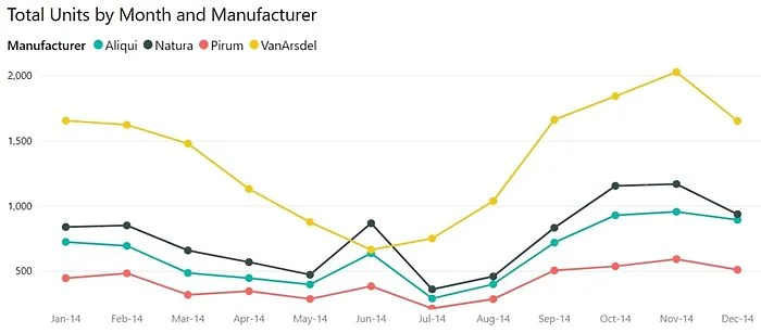
A line chart is a type of chart that is used to visualize data over a continuous time period. It is made up of a series of data points, connected by lines, that show the change in a particular variable over time. Line charts are commonly used to show trends in data over time, such as changes in stock prices, temperature, or population size. They can also be used to compare different sets of data, such as sales figures for different products or regions. Line charts are useful for showing both overall trends and specific fluctuations in data over time.
Bar Charts
A bar chart is a type of chart that is used to compare different categories of data. It is made up of a series of rectangular bars, with each bar representing a different category of data. The height or length of the bar represents the magnitude of the data for that category. Bar charts are useful for comparing data across different categories and for showing both overall trends and specific differences between categories. They are commonly used in fields such as business, economics, and statistics. Bar charts are also frequently included in free math worksheets to help students practice interpreting and analyzing visual data representations.
Area Charts
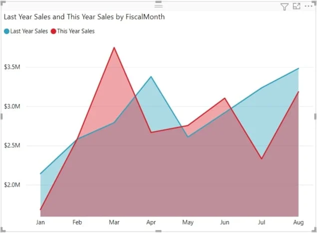
An area chart is a type of chart that is used to visualize data over a continuous time period. It is similar to a line chart, but instead of showing data points connected by lines, an area chart fills in the space between the data points and the x-axis with a colored area. This helps to show the overall trend in the data, as well as the relative magnitude of the data at different points in time. Area charts are commonly used to show how a variable has changed over time, such as changes in population size or stock prices. They can also be used to compare multiple sets of data, such as sales figures for different products or regions.
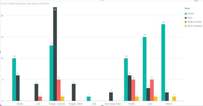
Columns Charts
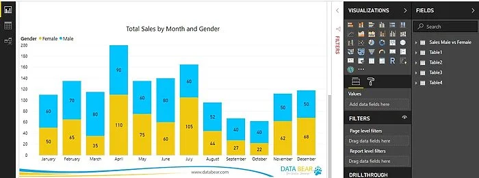
A column chart is a type of chart that is used to compare different categories of data. It is made up of a series of vertical bars, with each bar representing a different category of data. The height of the bar represents the magnitude of the data for that category. Column charts are useful for comparing data across different categories and for showing both overall trends and specific differences between categories. They are commonly used in fields such as business, economics, and statistics. Column charts are similar to bar charts, but the bars are vertical instead of horizontal.
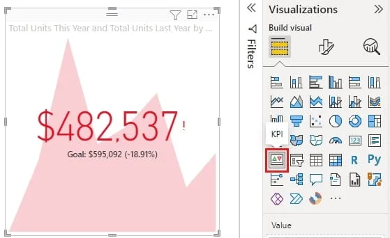
Cards
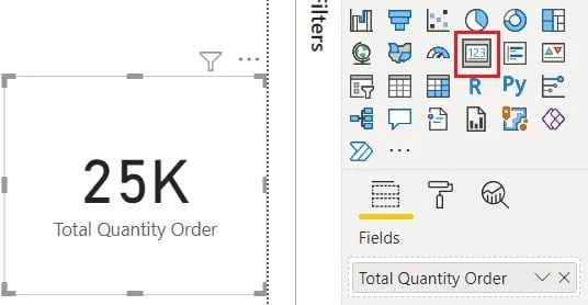
A Card visualization can vary from a single number, such as total sales, market share year over year, or total opportunities, is sometimes the most important thing you want to track. A type of visualization in Power BI called a card may be the best way to view that number. As with almost all of the native Power BI visualizations, cards can be created using the interactive report editor or Q&A.
Combo Charts
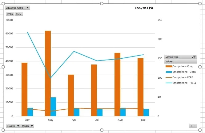
A combo chart is a type of chart that combines two or more chart types into one. This allows you to display multiple types of data in a single chart and can be useful for comparing different types of data or for highlighting specific patterns or trends. For example, a combo chart might combine a column chart and a line chart to show both the overall trend and specific fluctuations in data over time. Combo charts are commonly used in fields such as business, economics, and statistics. Power BI, a popular data visualization tool, allows users to create combo charts using a wide range of chart types, including column and bar charts, line charts, and scatter plots. Many Power BI consulting firms specialize in helping businesses leverage these charts effectively to visualize complex data.
Pie Charts
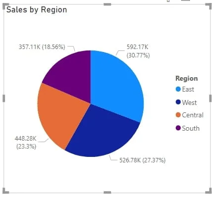
A pie chart is a type of chart that is used to show the relative sizes of different categories of data. It is circular in shape and is divided into slices, with each slice representing a different category of data. The size of each slice is proportional to the magnitude of the data it represents. Pie charts are commonly used to show how a whole is divided into different parts, such as the market share of different companies or the budget of a government agency. They are useful for quickly and easily showing the proportions of different categories of data.
Doughnut Charts
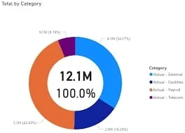
A doughnut chart is a type of chart that is similar to a pie chart, but with a hole in the middle. Like a pie chart, a doughnut chart is divided into slices that represent different categories of data, and the size of each slice is proportional to the magnitude of the data it represents. The hole in the middle of the chart can be used to show additional information, such as the total value of the data or the percentage of the whole that each category represents. Doughnut charts are commonly used to show how a whole is divided into different parts, such as the market share of different companies or the budget of a government agency. They are useful for quickly and easily showing the proportions of different categories of data.
Decomposition Tree
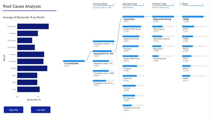
A decomposition tree is a type of chart or diagram that is used to break down a complex process or problem into smaller, more manageable parts. It is often used in business and management to analyze and understand complex systems, such as supply chain networks or organizational structures. A decomposition tree typically starts with a single, high-level process or problem at the top, and then breaks it down into smaller and smaller sub-processes or sub-problems as you move down the tree. This can help to identify the key components of a process or problem and to understand how they are related to each other. Decomposition trees can be useful for identifying potential areas for improvement and for developing solutions to complex problems.
Funnel Charts
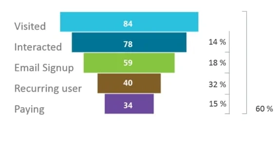
A funnel chart is a type of chart that is used to show the flow of data or process steps from one stage to the next. It is shaped like a funnel, with the top of the chart representing the beginning of the process and the bottom of the chart representing the end. Each stage in the process is represented by a different section of the funnel, with the width of the section representing the quantity of data or process steps at that stage. Funnel charts are commonly used to show how a process progresses from one stage to the next, such as the sales process in a business or the steps in a marketing campaign. They can also be used to show how data flows through different stages of a system, such as a supply chain network. Funnel charts are useful for identifying potential bottlenecks or areas for improvement in a process or system.
KPIs
A KPI (Key Performance Indicator) visual is a type of chart or data visualization that is used to show the status of one or more key performance indicators. A key performance indicator is a measurable value that is used to track the performance of an organization or system against specific goals or targets. A KPI visual typically includes a number or value that represents the current status of the key performance indicator, as well as graphical elements such as gauges or bar charts that show how the current value compares to the target or historical values. KPI visuals are commonly used in business and management to track the progress of an organization or system towards its goals and to identify areas for improvement.
Just as professional human writing turns complex thoughts into clear arguments, data visualization allows users to see patterns in data that might not be obvious from raw numbers. If you are struggling to communicate your findings effectively, you can find expert essay help or ask a professional to do my presentation for me to ensure your final report is both insightful and persuasive.
Gauge Charts
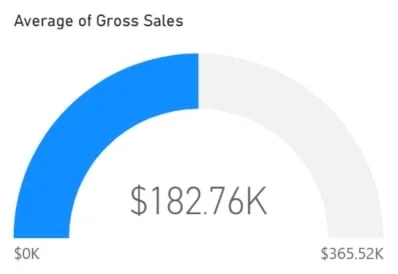
A gauge chart, also known as a speedometer chart or dial chart, is a type of chart that is used to show the current value of a particular data point relative to a predetermined range or scale. It is typically circular in shape, with a needle or pointer that indicates the current value on the chart. Gauge charts are commonly used to show the status or progress of a particular metric, such as the current sales figures for a product or the current level of customer satisfaction. They are useful for quickly and easily showing whether a metric is within a desired range or above or below a target value. Power BI, a popular data visualization tool, allows users to create gauge charts using a variety of options for customizing the look and feel of the chart.
Waterfall Charts
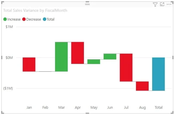
A waterfall chart is a type of chart that is used to show how an initial value is affected by a series of intermediate positive or negative values. It is made up of a series of horizontal bars that represent the different values, with the initial value at the beginning of the chart and the final value at the end. The intermediate values are represented by bars that extend either upwards or downwards from the previous value, depending on whether they are positive or negative. Waterfall charts are commonly used in finance to show the contributions of different factors to the overall change in a value, such as the change in net income over a period of time. They can also be used in other fields to show how a value is affected by a series of intermediate steps or events.
Maps
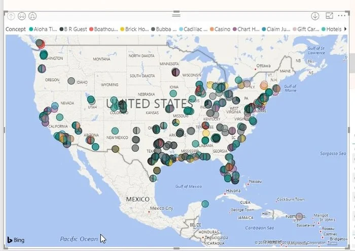
Power BI Maps is a feature of the Power BI data visualization tool that allows users to create and customize maps to display their data. With Power BI Maps, users can create map visualizations using a wide range of map styles and layers, such as street maps, satellite imagery, and demographic data. They can also add custom data to the map, such as locations of sales offices or distribution centers, and use a variety of formatting options to customize the look and feel of the map. For more advanced solutions, you might need to hire Power BI developer to create interactive maps that can be explored and filtered by the user, making it easy to visualize and analyze data in a geographic context.
Matrix
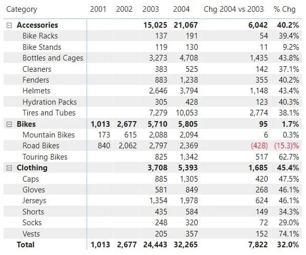
A matrix in Power BI is a type of data visualization that allows users to display data in a grid format. It is similar to a table or a spreadsheet, but it includes additional formatting and visualization options that make it easier to analyze and understand the data. A Power BI matrix can include multiple rows and columns, with each cell in the matrix representing a different value in the data. Users can use a matrix to display data from multiple sources and to compare different sets of data. They can also use formatting options, such as data bars and color scales, to highlight important trends or patterns in the data. Matrix visualizations are commonly used in fields such as business, economics, and statistics.
Conclusion: Best Power BI Visuals
In this article, we went through the most used Power BI visualizations and charts to best highlight the data’s insight, while explaining what every chart & visualization can actually show & highlight.
Now you can start to test your newly learned skills.
Start your 30 days free trial today with Windsor.ai
FAQ: Best Power BI Visualizations & Charts
What is the goal behind Data Visualization?
The goal of data visualization is to help users better understand and make sense of complex data by making it more accessible and intuitive.
What is the best way to learn about visualizations?
The best to learn how to create and manipulate visualizations is to use ready Power BI templates or test out other tools like Power BI alternatives.
Where to download, install or add custom visualizations to Power bi Desktop?
You can add or install custom visualization by press on the three dots under visualizations you ll be redirected to Power bi Visuals marketplace.
You May Be Also Interested in:
- Use Cases for Power BI in Marketing Analyst
- Connect Pipedrive to Power BI
- Connect Salesforce to Power BI
- Connect Twitter Ads to Power BI
- Connect Snapchat Ads to Power BI
- Connect Bing Ads to Power BI
- Connect Zoho to Power BI
- Connect Linkedin Ads to Power BI
- Connect Klaviyo to Power BI
- Connect HubSpot to Power BI
- Connect Instagram to Power BI
- Connect Tik Tok Ads to Power BI
Power BI Data Sources: Different Types & How to Connect Them

